BY MICHAEL GOODPASTER

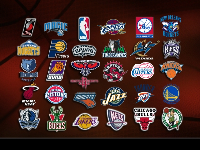
(FOUR) PORTLAND TRAIL BLAZERS
I’m look at the current batch of NBA logos. So this means the 2010-2011 season. Off the bat, I’m a Bulls fan. I’m bias towards them for sure. Still I’m going to try to be partial. I’ll sport their logo and represent it proudly, but it’s not the best looking logo out there. I’m going to judge the logo on impact, style, and pretty much just personal taste. At the bottom of this column, I’m including a small picture. You’ll have to look for bigger pictures on your own, but you’ll get a really small thumbnail example on there. For the “FOUR” pick, I’m going with Portland. I know, right? I’m crazy. No, Portland is crazy. Their logo is just some white and red lines curving into each other. It’s bland, it’s boring, and kind of looks like a “69”. That counts enough for at least the four spot. Maybe even higher.
(THREE) THE NBA LOGO
It’s Jerry West, right? I think that’s what I’ve been told before. This logo is a dog-tag shaped design with a man with a ball with blue and red on each side of him. It’s almost like the blue and the red are cut out to show the player, which again I assume is Jerry West. There are tons of logos in the NBA history. Some have stayed around, some have been altered over time, and some are pretty fresh still. One constant is the bad ass NBA logo. It’s surely the best sport brand logo out there and maybe the best logo in sports. It’s not just a sports logo, it’s a brand. The biggest.
(TWO) LAKERS/CELTICS
The yellow basketball with the royal purple spelling out “Lakers” in slightly stylized italics is pretty much the “Yankee” logo of basketball. I’m pretty sure that it’s the most universally thought of logo. Same with the Celtics logo. If the Lakers is the Yankees logo of the NBA that makes the Celtics logo the LA Dodgers logo. Ironic huh? It’s a Irish leprechaun looking fellow with a circle behind him. It’s well designed but nothing groundbreaking. Its history is what sells it. Visual, eh, but in a marketing and branding sense these two logos are money. The Bulls and Knicks are probably up there too, but not quite on par.
(ONE) HOUSTON ROCKETS
It’s a ghostly sci-fi looking “R” with a hoop/ring around the bottom of it. It sounds simple in execution, but stylized in a pretty neat way. This logo is cool just because it’s so different than all the rest. The others are big bold and often cartoonish. This logo looks like a logo you’d see on a bad ass super hero or in a horror movie or used as a band logo. I’m not a fan of the Rockets, but I’d wear something with JUST their logo and no text in a heartbeat. It being one of the few logos in the NBA that doesn’t have a basketball in it get it extra points.
|