|
|
|

|
|
[MUSIC] THE SAVAGE ANIMAL
"10 Random Band Sites V1" |
11.17.10 |
BY MIKEY MIGO
With the push and rise of social network sites like facebook and twitter is there even a use for official websites anymore? I think so. With a facebook you really can't add any of your own identity to the page. It's a flat looking and boring page to throw some tour dates on and to post updates. With twitter it's a lot of the same. The artist drops updates on their life to the world and interacts a little. Still, there is a need for information and if you're wise enough to not trust Wikipedia then you need an official source. This is why official band pages are still in demand.
An artist needs their own web space for many reasons. The main reason is to push whatever new project or product they want you to buy be it album, TV show, T-Shirt, or really anything. They have it in stock and they want YOU to buy it. Once you have the music playing, the shirt and hat on, and poster on your wall… there's MORE! Oh yeah, there's more. You also need to get your tour tickets and plan ahead. You don't want to look dumb at the show, in your official shirt and hat, so you gotta look up lyrics so you can sing-a-long with karaoke precision. We can't forget that talk show appearance or magazine cover that's around the corner so we better keep an eye on the news section. Then once we're all caught up, there is surely going to be little square box links for the artist's facebook and twitter. Make sure you add them on both because something profound is surely to be said on one of these pages. We'll ignore the fact that a publicist or someone else is the one doing the update in most cases. By the way, make sure you bookmark!
That may have sounded a bit sarcastic, and it was in a way, but seriously, a musician without an official page is basically saying "Hey, I'm just doing this for myself… please DON'T listen". The same goes for those bands where you get a splash/front page, click "enter" or whatever and you're redirected to a MySpace page. That's a cop out. We're a decade into the 2000's. The days of angelfire and livejournal are behind us. If you can't put together a page for your band then you're just not taking yourself, your art, or your potential serious enough.
Today, we're going to take a look at a few current websites out there. I'll acknowledge off the bat that there is going to be artists that I'm not a fan of. I'm not directly looking to critique the band's music, but I will not hold back my jabs. I'm looking at the website. Is it innovative? Is it visually appealing? Does it function? Does it represent the artist well? Let's find out the answer those questions…
ARTIST: COHEED AND CAMBRIA
THE WEBSITE: coheedandcambria.com
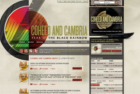
[Rating: 8.5] This is a band that I respect, but never really got fully behind. I did a first impressions piece on this a few months ago and their music wasn't my cup of tea, but I can see the appeal and am curious in their artistic evolution. Their site is awesome. The layout is easy to navigate, but isn't your typical bland band page. The first page you see is all you really need. It has the tour dates right there, news, and a very noninvasive music player. In most cases when you go to a band's page you're overwhelmed with flashy visuals, autostart music, and video. For a band that's so in depth with the story of their music and image, it's refreshing to see them scale back for the site. This is one of my favorite pages I've encountered this week.
ARTIST: NICKI MINAJ
THE WEBSITE: mypinkfriday.com
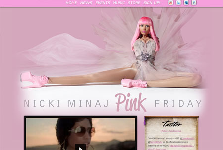
[Rating: 3.0] For such an "eccentric" artist, you'd think the website would match the personality. The site's only personality is that it's pink and has her gawky image right there at the top. I mean I guess you get what you ask for. When you go to a musician's website you get music, you go to Nicki Minaj's website and you get Nicki Minaj.
ARTIST: TAYLOR SWIFT
THE WEBSITE: taylorswift.com
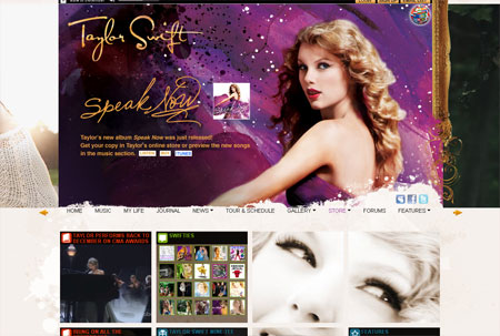
[Rating: 5.0] I'm not a fan of Swift's music and as cute as she is, she creeps me out. To me, she looks like a scared doe and really frail. The look in her eyes is best described as "absent". That withstanding, I surprisingly dig her website. Like her musical style, the website is pretty paint by numbers. I've seen many sites that look like this, but it's the little things that impress me about it. You can switch out the big top image between three choices and the music player is there, but doesn't automatically start. Being on her website has to be what she felt like when she was interrupted by Kanye West. You look at it for a few minutes and before you know it you don't know what else to do and you're confused. It gets old quick. Kanye should interrupt her website….
ARTIST: KANYE WEST
THE WEBSITE: kanyewest.com
[Rating: 2.0] Speaking of Satan himself. This is embarrassing. I went with Kanye for my next choice because after seeing "Runaway" I just assumed his website would melt my screen. In fact, this is the worst website I've seen from someone of his stature. It's a plain black page. The big video screen at the top doesn't even play! It's a pop up link to the film on the evil VEVO site. You scroll down and there's about a dozen downloads. To download you must enter your email address so you can be reminded daily about things Kanye wants you to buy and look at. Then the album cover for his new release. That's it. I'm generally a Kanye defender, but I can't defend this website. I don't care what the reason is, this is bad.
ARTIST: MARILYN MANSON
THE WEBSITE: marilynmanson.com
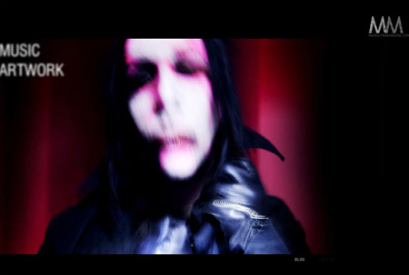
[Rating: 9.0] I've always been a Manson fan. His websites have always been crazy experiences and some of the most cutting edge work I've seen. This website isn't any different. On the surface it looks like a blander than Minaj type of page. But no. Oh no. The big images start to rotate over and over. Eventually it loads into some really weird video. The longer you let the page sit the more and more visual carnage is unleashed. I let it sit for even longer and even more creepy video stuff loads. The page is easy to navigate and is one of the few truly artistic visions out there. You can get your needed information on the page, but it's much more than that. It's art. Say what you want about the man, but you can't deny the awesomeness of this page.
ARTIST: KINGS OF LEON
THE WEBSITE: kingsofleon.com
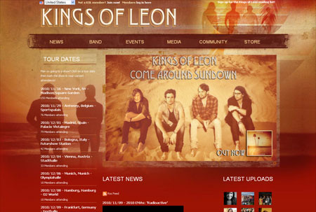
[Rating: 6.0] As much as I want to boycott all that is Kings of Leon, this site has potential. It's eye catching and seems pretty easy to navigate. I dig the autumn colors and the whole retro surfer type of vibe it goes for. On the surface this site is nifty, but it gets pretty boring quick. Soon you find yourself just flat out annoyed. It's a pretty cold and sterile site. It feels forced and fraudulent. Wait, am I talking about the band or the site? I'm not even sure anymore. Site is decent.
ARTIST: KID CUDI
THE WEBSITE: kidcudi.com
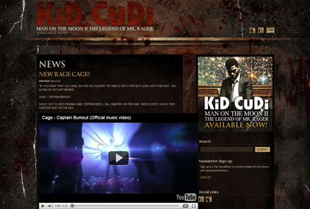
[Rating: 4.0] Another let down. It looks cool and all, but for someone as "hip" as Kid Cudi you'd think he'd have a more contemporary website. It looks like a million other sites out there. The colors and imagery is boring and doesn't stand out at all. Being optimistic, the site isn't too cluttery. It's precise and to the point. The problem is just the lack of artistic value and substance. It's functional, but there's just not enough functions for that to be a good enough excuse to give this a good grade.
ARTIST: U2
THE WEBSITE: u2.com
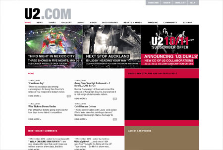
[Rating: 7.0] After clicking through a pointless splash page you find yourself on U2's homepage. The page gets most its points from me based purely on the functionality of the page. It's easy to navigate and has more content and time wasters on the site than another other we've looked at today. That's cool and all, but the page is still ugly. It's boring, bland, and does not showcase the often great artwork and photography the band has. You'd think the biggest band in the world could spring for something a little more visually stimulating. I'm a diehard U2 fan so I'm content because I can pretty much find any information I want with ease on the page, but for a casual fan I could see this site being clicked out of pretty quickly.
ARTIST: NINE INCH NAILS
THE WEBSITE: nin.com
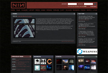
[Rating: 7.5] I'm bias. If you've read more than two editions of The Savage Animal then its likely apparent that Nine Inch Nails is my favorite band of all time. This is true, but I still want to be fair minded. This site is a lot like the U2 page. It's functional and loaded with content and things to do, but it's not flashy at all. Still, it's got far much more style and character to it. It's simple, but uses the most recent of NIN fonts and the colors are easy to absorb. Again, I'm bias. There's no way around it. The site is very good, but could use a dash more of glitz to it. That's about as fair as I can be on it.
ARTIST: MUMFORD & SONS
THE WEBSITE: mumfordandsons.com
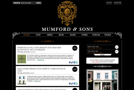
[Rating: 8.0] One of the biggest indie bands out there right now is a little band by the name of "Mumford & Sons". It seems like a few times a year a indie darling will break out and get a lot of play. One of those recent ones is this band. I like this site. I enjoy the lay out, the style, and the boldness of it. It is easy on the eyes, easy to navigate, and has pretty much every ingredient a band website should have. I kind of like the band, but I really like this website.
What is YOUR favorite band website out there?
|

|
| | |