|
|
|

|
|
[MUSIC] THE SAVAGE ANIMAL
"Album Art in Review [Winter 2012]" |
01/11/12 |
BY MIKEY MIGO

In 2012, the idea of “album art” has merely become a JPEG thumbnail image to represent a sound file. I’m an appreciator of displayable art, but we can’t ignore the progress of how things are evolving. The old people around for vinyl were pissed when music evolved to the cassette because the art space went from a foot squared to smaller than an index card. Then things eventually went to CD. Now its mp3 and I’m sure it’ll evolve into something else before too long. The point being…visual art will always be part of modern music.
I read a while back ago that Mos Def released a digital album, but still got his vision of album art out there by including a shirt with the art on it. I thought that was a great idea and I’m surprised it didn’t take off. What’s cooler than having people WEAR your album art? I think this idea and concept should be looked at again because there is really something there.
Until something innovative happen, here are some JPEGs of recent albums. I’m going to look at them, give my personal opinion. I’m not saying I’m right, but I’m definitely not wrong. It’s all subjective. I’ve had a deep appreciation for art, layouts, and things of that nature. I’ll try to use that experience to not sound completely stupid. Feel free to discuss…
Album: ”21”
Artist: Adele
 This is the biggest album of the past year. Adele really broke through big time with this album and the slew of hits from it. The cover of this album is a classy and candid black and white photograph of Adele. It’s a very casual “captured moment” type of shot. I’m also a fan of the fact that there is no pure white. All of the “white” is a shade of grey. It’s a good blend of shade and it’s really easy to look at. The text on it is as simple as can be, but compliments the message nicely. This is the biggest album of the past year. Adele really broke through big time with this album and the slew of hits from it. The cover of this album is a classy and candid black and white photograph of Adele. It’s a very casual “captured moment” type of shot. I’m also a fan of the fact that there is no pure white. All of the “white” is a shade of grey. It’s a good blend of shade and it’s really easy to look at. The text on it is as simple as can be, but compliments the message nicely.
Rating: 8.0
Album: ”Camp”
Artist: Childish Gambino
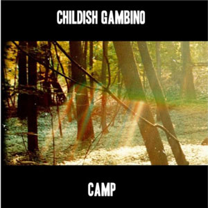 Community actor Donald Glover released a hip hop album in November under the alias of “Childish Gambino”. The singles, the videos, the talk show appearances, and everything I’ve seen or read from this project seems to be on fire. I don’t see this guy’s skills being kept quiet for too long. The album cover is simple as shit. It’s a “letterbox” looking album cover. A simple white text with the info above and below a single image. It’s a shot of the woods with a weird sun ray coming down. It’s simplistic and all that. The picture might be a inside reference or a personal shout out, but to the average fan it’s boring. Community actor Donald Glover released a hip hop album in November under the alias of “Childish Gambino”. The singles, the videos, the talk show appearances, and everything I’ve seen or read from this project seems to be on fire. I don’t see this guy’s skills being kept quiet for too long. The album cover is simple as shit. It’s a “letterbox” looking album cover. A simple white text with the info above and below a single image. It’s a shot of the woods with a weird sun ray coming down. It’s simplistic and all that. The picture might be a inside reference or a personal shout out, but to the average fan it’s boring.
Rating: 3.0
Album: ”Mylo Xyloto”
Artist: Coldplay
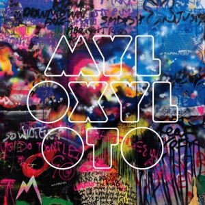 Remember U2’s “Pop” album with the nine different panels of graffiti/colorful/scribble looking art? If not, look at the newest Coldplay album cover and imagine it looking like at least four times cooler. I like the fact that the artist used a lot of color and I genuinely do dig the use of font and typography. It’s just too similar to the classic U2 album. Can this band EVER stay away from U2 or Radiohead? Seriously… EVER? Yeesh! Remember U2’s “Pop” album with the nine different panels of graffiti/colorful/scribble looking art? If not, look at the newest Coldplay album cover and imagine it looking like at least four times cooler. I like the fact that the artist used a lot of color and I genuinely do dig the use of font and typography. It’s just too similar to the classic U2 album. Can this band EVER stay away from U2 or Radiohead? Seriously… EVER? Yeesh!
Rating: 7.0
Album: ”The Dreamer/The Believer”
Artist: Common
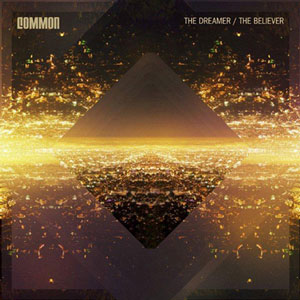 This is a really cool cover. I used to really like looking at my dad’s old album covers because there were times you didn’t know who the artist was because the cover was some weird abstract image. Think about the weird rainbow/triangle thing Pink Floyd had. I get a vibe like that from this Common album. It’s a weird abstract diamond looking image with some sort of weird explosive energy coming from it. The album titles are simple and his name is very nicely added to the top in a perfectly sized level. If this album is as good as the cover then I need to actually listen to it. This is a really cool cover. I used to really like looking at my dad’s old album covers because there were times you didn’t know who the artist was because the cover was some weird abstract image. Think about the weird rainbow/triangle thing Pink Floyd had. I get a vibe like that from this Common album. It’s a weird abstract diamond looking image with some sort of weird explosive energy coming from it. The album titles are simple and his name is very nicely added to the top in a perfectly sized level. If this album is as good as the cover then I need to actually listen to it.
Rating: 8.0
Album: ”Take Care”
Artist: Drake
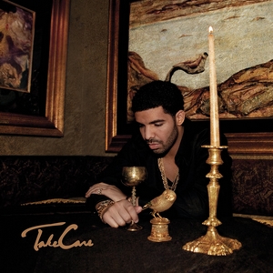 “The Canadian Johnny Bravo” is back with his second album. I still can’t take “Jimmy From DeGrassi” serious at all. His horrible facial hair isn’t helping either. He’s already a creepy 45 year old at the ripe young age of twenty-whatever. The album cover is interesting though. The colors, the deep golds and greys, the lay out, and all of that is just really well done. It’s a really good photograph. My issue is that if I cared enough to think about this album for more than this paragraph I’d be really bothered by not knowing what he’s looking at inside that chalice cup thing. Is it Sprite? Is it blood? Is it maple syrup? Is it empty? So many questions… “The Canadian Johnny Bravo” is back with his second album. I still can’t take “Jimmy From DeGrassi” serious at all. His horrible facial hair isn’t helping either. He’s already a creepy 45 year old at the ripe young age of twenty-whatever. The album cover is interesting though. The colors, the deep golds and greys, the lay out, and all of that is just really well done. It’s a really good photograph. My issue is that if I cared enough to think about this album for more than this paragraph I’d be really bothered by not knowing what he’s looking at inside that chalice cup thing. Is it Sprite? Is it blood? Is it maple syrup? Is it empty? So many questions…
Rating: 7.0
Album: ”Ceremonials”
Artist: Florence + The Machine
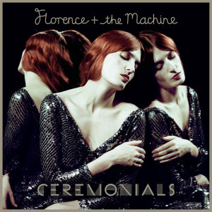 This is another solid image. It’s a really artistic photograph with simplistic text put above and below. The top font is a weird cursive and the album title is some weird shaped letters. It’s not bad. The photo is cool. She’s REALLY pale, but it makes the red in her hair pop more. The weird soulful expression sums up the artist pretty well. This is a good cover, but it’s forgettable. I like her music and stuff, but the art leaves much to be desired. This is another solid image. It’s a really artistic photograph with simplistic text put above and below. The top font is a weird cursive and the album title is some weird shaped letters. It’s not bad. The photo is cool. She’s REALLY pale, but it makes the red in her hair pop more. The weird soulful expression sums up the artist pretty well. This is a good cover, but it’s forgettable. I like her music and stuff, but the art leaves much to be desired.
Rating: 7.0
Album: ”Torches”
Artist: Foster The People
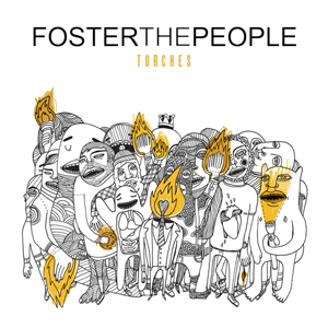 The track “Pumped Up Kicks” has been making them pretty big, but it’s been a steady rise for them lately. Obviously, an indie rock album. That’s not a horrible thing, but it’s in the ballpark. The cover is a really cool hand drawn image. It looks like a cross between “Where The Wild Things Are” and the cartoon drawings from the “Paranoid Anroid” Radiohead video. A few of the characters are holding touches… and a flash light. Interesting and fun cover. The track “Pumped Up Kicks” has been making them pretty big, but it’s been a steady rise for them lately. Obviously, an indie rock album. That’s not a horrible thing, but it’s in the ballpark. The cover is a really cool hand drawn image. It looks like a cross between “Where The Wild Things Are” and the cartoon drawings from the “Paranoid Anroid” Radiohead video. A few of the characters are holding touches… and a flash light. Interesting and fun cover.
Rating: 7.5
Album: ”The Great Escape Artist”
Artist: Janes Addiction
 I’ve not heard anything from this new Janes Addiction album. I’ve always been a casual supporter of the band and have dug radio singles, but it’s never been a band I’ve gone out of my way for. This is a really bad ass image. This was actually made. This is all miniatures and the character was actually designed and fabricated by Perry Farrell himself. That’s cool shit. Lots of detail and time went into this one. It’s much more than a classy photograph or a smooth graphic design. You can tell Perry’s got an old school appreciation for album art. I’ll have to check this album out… I’ve not heard anything from this new Janes Addiction album. I’ve always been a casual supporter of the band and have dug radio singles, but it’s never been a band I’ve gone out of my way for. This is a really bad ass image. This was actually made. This is all miniatures and the character was actually designed and fabricated by Perry Farrell himself. That’s cool shit. Lots of detail and time went into this one. It’s much more than a classy photograph or a smooth graphic design. You can tell Perry’s got an old school appreciation for album art. I’ll have to check this album out…
Rating: 8.5
Album: ”The Path of Totality”
Artist: Korn
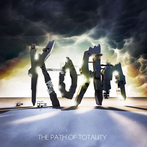 What can I say? I’m a teen of the late 90’s/early 00’s. I’m always going to be a fan of Korn. I’m more of a fan of their first five albums than their most recent five, but I’m not going to hate. The last album was pretty decent in relation to the others. I’ve still not listened to this album, but the cover isn’t doing any favors for it. This album cover has a cool idea in theory. The dark clouds, the light coming from behind the big cut out “Korn” letters. Apparently it has a lot of do with solar eclipses or something. I read what Jonathan Davis and Munky were going for, but it just didn’t translate to an exciting album cover. What can I say? I’m a teen of the late 90’s/early 00’s. I’m always going to be a fan of Korn. I’m more of a fan of their first five albums than their most recent five, but I’m not going to hate. The last album was pretty decent in relation to the others. I’ve still not listened to this album, but the cover isn’t doing any favors for it. This album cover has a cool idea in theory. The dark clouds, the light coming from behind the big cut out “Korn” letters. Apparently it has a lot of do with solar eclipses or something. I read what Jonathan Davis and Munky were going for, but it just didn’t translate to an exciting album cover.
Rating: 5.0
Album: ”Born This Way”
Artist: Lady Gaga
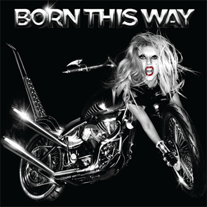 I’m not a huge Lady Gaga fan at all. I think she’s one of the most overrated artists to come in a LONG time. She’s got talent, but her image eclipses any potential for her to be a true musician. She’s an entertainer and I get that, but it doesn’t really feel like both. My negative opinion aside, this cover is pretty crazy. It looks like a bad graphic design project. Like a bad jokey fan art image. It’s a motorcycle with Gaga’s arms and head on the bike. How can you not look at this and remember it? THAT makes it a really successful cover. I’m not a huge Lady Gaga fan at all. I think she’s one of the most overrated artists to come in a LONG time. She’s got talent, but her image eclipses any potential for her to be a true musician. She’s an entertainer and I get that, but it doesn’t really feel like both. My negative opinion aside, this cover is pretty crazy. It looks like a bad graphic design project. Like a bad jokey fan art image. It’s a motorcycle with Gaga’s arms and head on the bike. How can you not look at this and remember it? THAT makes it a really successful cover.
Rating: 9.0
Album: ”Here And Now”
Artist: Nickelback
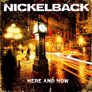 Fuck Nickelback. They suck and they’re the worst band to break into the mainstream possibly EVER. That includes the boy bands and Hanson. The kings of mediocrity put out their seventh album in November. The album is a photograph of the Gastown Steam Clock in Vancouver. The clock is set to 11:21 because the album came out on November 21st. How dumb is that? Why not a calendar? Wouldn’t that have made more sense? That said, it’s a well crafted shot. I’ll begrudgingly give it that much props… Fuck Nickelback. They suck and they’re the worst band to break into the mainstream possibly EVER. That includes the boy bands and Hanson. The kings of mediocrity put out their seventh album in November. The album is a photograph of the Gastown Steam Clock in Vancouver. The clock is set to 11:21 because the album came out on November 21st. How dumb is that? Why not a calendar? Wouldn’t that have made more sense? That said, it’s a well crafted shot. I’ll begrudgingly give it that much props…
Rating: 7.0
Album: ”El Camino”
Artist: The Black Keys
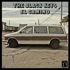 The cover isn’t an “El Camino” at all, but rather a Chrysler Town & Country van. When the band first started they toured in a van like that one. They did a whole promotional thing where they were selling the van online. They left a phone number, made fake ads, and even launched a website. That’s cool. It’s a simple image, but it has a back story AND is interactive. The Black Keys win again! The cover isn’t an “El Camino” at all, but rather a Chrysler Town & Country van. When the band first started they toured in a van like that one. They did a whole promotional thing where they were selling the van online. They left a phone number, made fake ads, and even launched a website. That’s cool. It’s a simple image, but it has a back story AND is interactive. The Black Keys win again!
Rating: 7.5
What is YOUR favorite recent album cover?
|

|
| | |


