|
|
|

|
|
[MUSIC] THE SAVAGE ANIMAL
"The Album Covers of U2" |
02.15.12 |
BY MIKEY MIGO

A band will put upwards to a year or more into writing, recording, and shaping a new collection of songs. These collected works are called albums; a physical piece of property that represents the work of that band. All of the time, effort, and passion going into the process. A great band will put their entire soul into these works. How it’s presented is important.
The first thing you actually see in terms of a new album is the cover. For years album covers were an important part of pop culture. Fans of music would have to use records. On these records were either artistic promo photography or art in itself to represent the music. That’s what the album cover does. It represents the album, the time period, and is part of history. I’ve always had a huge interest and love for album covers. I even dug cassette tape art. A really good visual product and promotional material to go with a really good album is an art in itself.
This is going to be a new feature in The Savage Animal. From time to time I’m going to take a deeper look at a band’s collection of album art. I want to see how it evolves, how it represents the band, the album, and the times. I just think it’ll be an interesting project to undertake.
The first band’s album art I’m going to check out is arguably the biggest and best band of modern rock and roll. I don’t know many people in my age group that really likes this band as much as I do. People get the wool pulled over their eyes on U2’s actual level of awesomeness. U2 deserves every bit of the success it has received. They made music that breaks through to the masses while still maintaining edge, creative leeway, melody, quality, and acclaim. They put out stuff that’s consistently solid. Some say their best days are in the past, but that doesn’t mean their new stuff isn’t better than anything else out there. A lot of the negative shit towards the band comes from dumb people shitting on Bono. Maybe he’s a little pushy and overbearing at times, but his heart is obviously in the right place and the man is doing more good for the world than probably anyone reading this.
For a band to have that much longevity, they have to evolve and explore new styles and try new things. The journey of U2 has been an awesome one. Let’s see if their album covers reflect that…
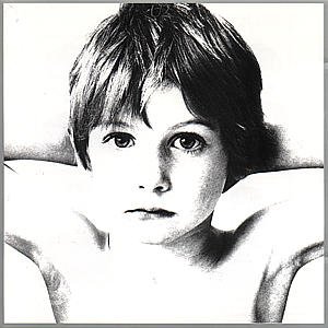
Album: Boy
Release: 1980
This was a pretty weird album cover. The album is called “Boy” and all, but it’s just a little unsettling. The creepy stare and blank face is almost jarring. The boy here is Peter Rowan. He’s 37 now and lives in Dublin, Ireland. He’s the little brother of a school friend of Bono. He would appear on a few album covers and in one video. He’s now a photographer himself.
Rating: 7.0

Album: October
Release: 1981
The original cover had the same picture, but shrunk down with a whole lot of white space and small text informing the listener of the track titles. When it was released wide it was cropped down to just feature the picture and the title text. The band looks so young. Those jackets and hair styles are great. The actual photograph is pretty cool. The composition is strong and I like the way the band is positioned and how they all seem to be looking in different directions. Later one, you’ll find out that this would be an attribute of one of my favorite album covers.
Rating: 8.0

Album: War
Release: 1983
Peter Rowan returns! A little older, a little wiser, and a little angrier. I think this is a much stronger picture than “Boy”. The deeper contrast makes it pop more and makes it a much more demanding photo. Bono’s reasoning for the boy being on a cover for an album titled “War” was "Instead of putting tanks and guns on the cover, we've put a child's face. War can also be a mental thing, an emotional thing between loves. It doesn't have to be a physical thing." Well said.
Rating: 8.0

Album: The Unforgettable Fire
Release: 1984
The beautiful Irish castle on this cover is called Moydrum. The idea to use the castle as the cover was inspired by the cover of a book called “In Ruins: The Once Great House of Ireland”. They took the cover so much that this album cover’s similarity caused them to have to pay compensation. It was taken from the same spot, but they polarized it and had the band stand around. It’s a cool cover for sure. I don’t understand the framing. Why the red background? The font used is REALLY 80’s. The image is a copy, the color is boldly weird, and the font is dated. Being a bias fan I do have a connection to the cover, but on a visual sense it’s probably one of their weaker covers.
Rating: 6.0

Album: The Joshua Tree
Release: 1987
This is a great album cover. The band almost called this album “The Desert Songs”, based on the bands idea to use desert-like imagery for the album. The name would be changed in result of a series of images that’ll forever be part of music history. In late 1986 they worked with photographer Anton Corbijn on a three day photo shoot in the Mojave Desert. This three day shoot sounds like a story within itself. It was said that it was really cold during their shoot. This explains why they look so grim and grouchy in the photo.
Rating: 9.5
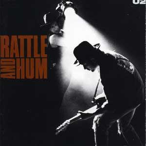
Album: Rattle and Hum
Release: 1988
This cover is simple an image with text. No weird cropping or anything. It’s a shot of Edge rocking out while Bono shines a spotlight on him. This is a shot from their live performance of “Bullet the Blue Sky”, one of my favorite tracks of theirs. It’s a really good shot.
Rating: 7.5
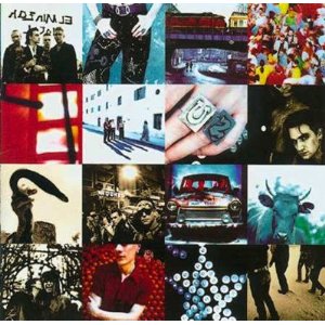
Album: Achtung Baby
Release: 1991
This is one of the coolest covers the band put out there. You just don’t see any album covers like this one. We see 16 squares of different images all coming together to form one image. They considered a few of these “cells” to be the full cover including the cow, a shot of Adam Clayton, and the band driving in a German car. The idea behind the album art was to push the alter egos and individual personas. To reflect their sound shift they wanted a more “dancey” cover. It’s been said that this is Bono’s favorite cover too. I think it’s because of the eyeliner.
Rating: 8.0

Album: Zooropa
Release: 1993
I used to have a big poster of this cover on my office wall for a few years. It’s clearly not the best album cover or even their best album, but I still proudly presented the art. It’s an interesting piece. It’s a collage of insanity. In my research for this, I actually learned more about it than I expected. The weird corroding purple is actually letters featuring pieces of song titles. Behind that is blurred squares of images. On top of it all is pixilated stars and a “sad cosmonaut” graffiti shot. They almost named this album “Squeaky”. How much cooler would that have been?
Rating: 7.0

Album: Pop
Release: 1997
This has to be one of the lamest covers of the band’s run. It’s four close ups of high contrast pixilated shots of the band members. The dull grey base color doesn’t do any of the images any favors. This is just a really lazy and unappealing cover. The font is even really boring. The album is a misunderstood piece of awesomeness, but the cover is so bad that I think people take it out on the music on this one.
Rating: 3.5

Album: All That You Can’t Leave Behind
Release: 2000
This is my favorite U2 album cover. I know that’s “crazy” considering we just looked at The Joshua Tree and Achtung Baby. Hear me out. The cover is a photograph taken by Anton Corbijn at the Charles de Gaulle International Airport in Paris, France. I remember staring at this album cover with so much awe. It’s a great photograph. Each band member is looking in a different direction, lost in their own world. Their 90’s covers were all big and colorful, but this understated black and white shot is perfect. The framing and the feel of the camera capturing a spontaneous moment is awesome. I know most could say this was around the time the band went “overly-commercial”, but this album is solid. The poster of this needs to be on my wall.
Rating: 9.5

Album: How to Dismantle an Atomic Bomb
Release: 2004
This is a decent cover. The centered black and white image of the band is cool. They all seem casual and laid back. It’s like they’re either worn out, waiting, or worn out AND waiting. It’s another one of those “captured moments” things. It’s the band in Portugal from another Anton Corbijn shoot.There is a really cool “retro” feel to this cover. The weird red sideways lines at the top are cool. It’s random, it’s bold, and it’s art. The weird red sideways lines are not pretending to be anything other than weird red sideways lines.
Rating: 7.5
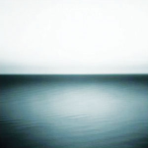
Album: No Line on the Horizon
Release: 2009
This is a photograph taken by Hiroshi Suimoto. It’s a blurred horizon line of the Boden Sea. It’s an interesting image and all, but not interesting enough to be a U2 album cover. It’s also a bit too similar to a Nine Inch Nail’s album cover. Like REALLY similar. I didn’t like it for that either. I know the title track of “No Line on the Horizon” makes the image make sense and is even said to have inspired the song. It’s still lack luster.
Rating: 4.0
|

|
| | |