|
|
|

|
|
[MUSIC] THE SAVAGE ANIMAL
"The Album Covers of Aerosmith" |
04.11.12 |
BY MIKEY MIGO
In 1970, the band Aerosmith was formed. Steven Tyler, Joe Perry, Tom Hamilton, Joey Kramer, and Brad Whitford never looked back. There were times the band would split off a little after too much tension, but at the end of the day these guys work best when they work together. They have one of the best front men of all time. Steven Tyler’s charisma is unmatched and unabridged. Joe Perry’s no-nonsense guitar playing rocks and you can see his style and smoothness in tons of great players to come after him. The rest of the band, Tom Hamilton, Joey Kramer, and Brad Whitford have proven to be consistently awesome. I can’t think of any moment while listening to Aerosmith did I think anyone one wasn’t carrying their weight. Aerosmith is one of those bands that’ll always exceed your expectations. There are bands I enjoy more. I’m sure I’m not alone. I know they have diehards, but Aerosmith is universal. Everyone knows Aerosmith. Everyone should know Aerosmith.
To really understand this, you have to look at the band’s awesome lineage. Aerosmith has been platinum more times than that most people would comprehend. They’ve won pretty much every award they can win. They have their own Guitar Hero. They have more number ones than most people have taken of number twos. I know that’s sorta gross, but so is denying this shit. Aerosmith is a music staple and I wouldn’t want to think of a world that didn’t involve their music. Then there’s the numbers. Aerosmith has sold far over 100 million albums around the world, over 65 million records sold in America alone. Over 100 million! That’s a lot. The band has released 5 live albums, forty five singles, and fourteen studio albums.
Today I’m going to take a look at those fourteen album covers…
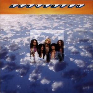
Album: Aerosmith
Release: 1973
This has to be one of the best debuts of all time. Any album with “Dream On”, “Movin’ Out”, and “Mama Kin” is great. This was their FIRST album. Impressive stuff. This cover isn’t all that great. It’s a shot of clouds with a smaller band picture in the middle. The font sucks on top and the coloring and layout of this cover is weak. They’d change the cover on later prints due to a misprint. It was a tighter shot of the band and the font was much better. This album is great, the cover not so much.
Rating: 2.0
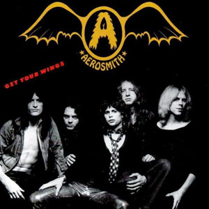
Album: Get Your Wings
Release: 1974
“Train Kept A Rollin’” was one of the only tracks on this album that I’d want to go out of my way to hear. Still, it’s a good effort. This cover is leaps and bounds cooler and better than the first first album. A weird fuzzy-A bat logo is at the top of an interesting band photo. It’s forever ago so the band looks really young, but it’s the same dude’s we’ve all be listening to forever. Fairly decent cover.
Rating: 6.5
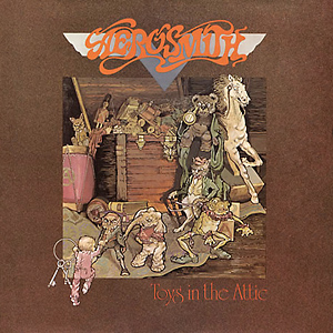
Album: Toys in the Attic
Release: 1975
As a child I ruined my father’s copy of this album because I really wanted to hear the Run DMC version of “Walk This Way”. This album is one of their best with the original version of “Walk This Way”, “Big 10 Inch Record”, and the all-time great “Sweet Emotion”. This cover is a favorite too. The artwork, the animation, the layout, and the font is perfect. The toys on this cover always creeped me out, but it for sure stuck with me growing up. Great cover.
Rating: 8.0
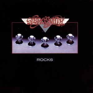
Album: Rocks
Release: 1976
The album is classic, but the cover is a little boring. You’d think an album with “Back in the Saddle” on it would have a cooler cover. Using the same font and logo of Toys in the Attic, this album went simple. A clean and bold font tells us the album title and we’re presented a nice shot of metallic looking tops or diamonds or something like that. I can’t really tell for certain. Fair enough.
Rating: 5.5
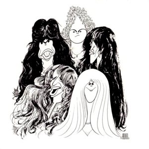
Album: Draw the Line
Release: 1977
This is one of the band’s harder albums from their drug haze days. We still get “Draw the Line” and “Kings and Queens” among other gems. The cover is a portrait drawing by famous celebrity caricaturist Al Hirschfeld. The drawing is fun. It’s a simple black and white drawing and looks like something that should be on the all in an old Hollywood restaurant. It’s a cool cover and a cool drawing.
Rating: 7.5
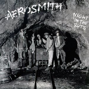
Album: Night in the Ruts
Release: 1979
This album was lackluster. In the middle of recording the band had to tour to make up the money they were losing (snorting?). By the time they got back to the studio to finish it up Joe Perry had left the band. It would still eventually go platinum. The cover is a black and white photo of miners in a mine shaft. The text is spray paint/chalk looking on the rocks. The cover itself isn’t half as bad as the actual music on it.
Rating: 6.5
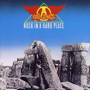
Album: Rock in a Hard Place
Release: 1982
People hate this album. Brad Whitford is on there a little, but he left the band too by this point. It’s widely considered the band’s worst album. I don’t think it’s absolutely horrible, but it just didn’t feel right. The cover is Stonehenge. It’s been said this bold cover inspired the Stonehenge gag from Spinal Tap. That’s enough credibility for me!
Rating: 5.5
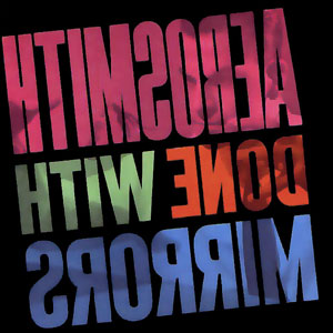
Album: Done with Mirrors
Release: 1985
By this point everyone is back in the band and the guys were on their own personal roads to recovery. There are a few favorites on the album, but it’s not often considered one of the band’s best. The album title is a double entendre based on magician-like illusions and a tongue-in-cheek joke about their use of mirrors with cocaine. This original cover is pretty interesting. The font is big and bold. To properly read it, you have to hold it up to a mirror. That’s pretty ingenious. Good stuff.
Rating: 7.0

Album: Permanent Vacation
Release: 1987
Ninth album. This is the point where Aerosmith’s career really took off. The band really got their shit together and put some one helluva album. The singles “Rag Doll”, “Dude Looks Like a Lady”, and “Angel” are fixtures in Aerosmith’s greatest hits catalog. The cover is pretty cool. The black background, the arrangement of red prints, and then the classic yellow logo. It looks like red outlined clip art and nothing else too special. Still, it’s an iconic cover because of how much exposure this specific album got.
Rating: 7.0
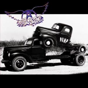
Album: Pump
Release: 1989
This one of the more critically acclaimed and widely loved released by the band. The album from front to back flows nicely and has some solid songs on it. The stands outs are “Love in an Elevator”, “The Other Side”, and “Janie’s Got a Gun”. You can’t deny the awesomeness of this one. The cover is weird though. It’s a photo of a truck humping a truck. At least that’s how it looks to me. I can’t hate that…
Rating: 6.0
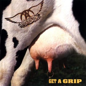
Album: Get a Grip
Release: 1993
I remember this cassette fondly. The singles on this album are ridiculous. Greatest hits like “Eat the Rich”, “Livin’ on the Edge”, “Shut Up and Dance”, “Cryin’”, “Crazy”, and “Amazing”. Holy shit. That’s a line up. This album is pretty much a greatest hits on it’s own. As a ten year old boy, this album cover made me uncomfortable. It has pierced utters with what appears to be a branding of the Aerosmith logo. As awkward as it is, it’s still a very bold and memorable cover. In that sense they accomplished a lot of with one. Ugh.
Rating: 7.5

Album: Nine Lives
Release: 1997
I remember when this album came out. It was received fairly well, but I do remember being underwhelmed after the Get a Grip hit fest. We did get “Pink”, “Falling in Love Is Hard on the Knees”, and few hidden gems like “Hole in my Soul”, and “Taste of India”. All in all, it’s a good way to spend an hour. This album cover ended up being changed to a cat on a knife throwers wheel after some protest and complaints. The dancing figure has a cat head and is dancing with snakes. Apparently there is something about it offensive to Hindu people. That sucks and it was completely unintentional. So really, this cover was a fail. The album is good though.
Rating: 2.0
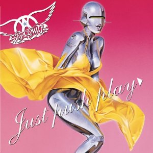
Album: Just Push Play
Release: 2001
It’s hard to believe this album is over ten years old. The big hit “Jaded” was really solid and back to true Aerosmith form. “Just Push Play” got a lot of play too over the years. This album has some decent stuff on it. It has a more electronic feel, but nothing too overbearing. It’s a solid effort. This cover sucks. In 2011 Joey Kramer said he didn’t like the cover, but did like the album. It’s a weird robotic version of a woman that resembles Marilyn Monroe. Hijime Sorayama did an awesome job with the design, but it just doesn’t feel right for an album cover.
Rating: 5.0

Album: Honkin’ on Bobo
Release: 2004
It’s the band’s most recent album. I don’t like to include this, but I will. It has eleven covers and one original track. Nothing about this album was all that awesome. The covers are passable. I dug the “Shame, Shame, Shame” and “Baby, Please Don’t Go” covers, but nothing much else. The cover is classy. A red velvet background with a lip-stick kissed harmonica laying with the logo on it. The font is classy and crisp. It’s put together well, but it’s as lackluster as the album.
Rating: 5.0
|

|
| | |