|
|
|

|
|
[MUSIC] THE SAVAGE ANIMAL
"The Album Covers of Pearl Jam" |
05.16.12 |
BY MIKEY MIGO
I watched Cameron Crowe’s documentary called Pearl Jam Twenty a few months ago. I was never the biggest Pearl Jam fan. I respect them and enjoy the singles, but they were never really a band I bought albums of or really got into. I was more into Nirvana, Soundgarden, and other 90’s bands. I watched this documentary and really absorbed the band’s story and awesomeness. The point in the film where Eddie Vedder “snaps” on security and gets that crazy look in his eyes is what sold me. You should see the documentary if you haven’t already.
There are plenty of reasons to dig Pearl Jam. They’ve been around for over twenty years and have been pretty damn consistent. They’ve evolved as artists and continue to put out quality work. I’ve never seen them in concert, but I hear they put on a great live show and give the fans their money’s worth. There are videos of theirs that stand out for sure. The “Jeremy” video was iconic, the “Do The Evolution” video was insane, and the more recent video for “The Fixer” was really innovative. I generally like the band. Even if they’re not your cup of tea, you can’t deny the fact that Pearl Jam is a staple in modern rock and roll.
But do their album covers hold up? They have all of these other things going for them that SOMETHING has to be lacking, right? Today I’m going to do my “art nerd” thing and stare at their album covers for a while and then ramble about them. It’s art, so it’s all subjective. I’m sure we’d all have different perspectives on this, but that’s okay. Let’s check them out…
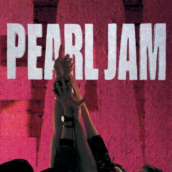
Album: Ten
Release: 1991
Bassist, Jeff Ament is credited here for the art direction and concept. This is a zoomed shot of a bigger image. On the vinyl of this iconic album, we see the entire band grouped together with their hands in center. In this more known zoomed in shot, we can see the vague pinkish “E and A” letters. On the zoomed out LP version you can clearly see the letters are spelling out the band’s name. Ament made these over-sided letters himself. I had never seen the vinyl version until now. Like a lot of people, the tight shot of the “all hands in” image is what I’m used to. Trying to objectively look at the cover, it’s not the greatest. The fact that it’s pink is weird too. Regardless, it’s a bold design.
Rating: 7.0
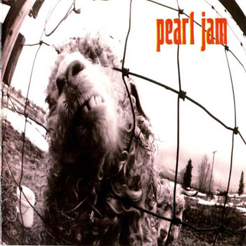
Album: Vs.
Release: 1993
I always thought this cover was a little unsettling. It’s a black and white photo taken by Ament of a sheep on a farm in Hamilton, Montana. At the time, the band was all over the music media and involved with a lot of hoopla. The original name of the album was “Five Against One”. The band was put into media-made rivalries to the point Ament stated “we were slaves”. Millionaire slaves? What?
Rating: 6.0
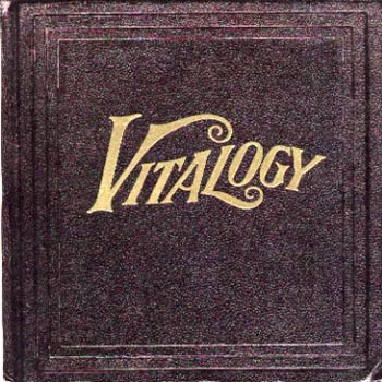
Album: Vitalogy
Release: 1994
Eddie Vedder said that at this point the band wanted try different approaches in terms of album packaging. This resulted in the band releasing what looked like a small book. Actually, it WAS a small book. Vedder found a medical book with the word “vitalogy”(“the study of life”) and once the band saw it they proclaimed it’d make a cool album cover. It is a really cool cover. I know there have been a lot of covers to come out that “look like a book”, but this one came at a time when no one else was doing anything this out of the box. It’s crazy to think a “book style folded” CD case would be so innovative because it’s been done over and over again since. We’re only three covers into this mini-critique, but this may be the best of their collection.
Rating: 8.0
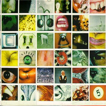
Album: No Code
Release: 1996
This is another great album cover innovation. I could be wrong, but I don’t think any band has ever done anything quite like this since. The album cover is a collection of 156 Polaroid arranged into a two by two square. The photos range from a shot of Dennis Rodman’s eyeball, Eddie Vedder’s foot, and others. When it’s all folded out, it’s one big picture with the No Code triangle/eye logo hidden in there. It’s pretty damn cool. Why someone didn’t do this on such a grand scale BEFORE 1996 is weird to think about. It’s such a simple idea, but executed in a really unique way. The little thumbnail images are all interesting on their own. As a collage of randomness, it’s even better.
Rating: 8.5
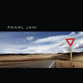
Album: Yield
Release: 1998
This looks like one of those old random LP album covers my dad has that I’d look at in awe as a child. This is a simple and sleek looking album cover. The font is clean and the “letter box” image is spot on. The empty road, the blue sky, the endless horizon, the simple “Yield” sign, and just the whole composition of the photo are really pleasing to look at. It’s a shot taken outside of Billings, Montana. I like this cover a lot. This album was nominated for a Grammy for Packaging. Rightfully so.
Rating: 8.0

Album: Binaural
Release: 2000
This album cover is cool with me for a few reasons. I like the simplicity of it, the abstract vibe, the back story, and the colors just makes it stand out. It’s simple, bold, and mysterious. It’s actually an altered photo of the Hourglass Nebula taken with the Hubble Space Telescope. That’s kind of cool. They had to get permission from NASA, which is kind of cool too. It feels like a lot of fans and casual supporters didn’t really like this album. I didn’t find it that bad at all. The cover might actually be cooler than the album on this one though.
Rating: 7.0
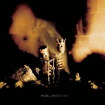
Album: Riot Act
Release: 2002
For some reason this cover isn’t as popular as I’d hope. It looks like a Tool video, which is probably why I’m so fond of it. We get a shot of two skeltons wearing crowns. The band enlisted the aid of a blacksmith to get these figures crafted. Once set up, Ament took the photograph. It’s a bit “darker” in tone compared to the other covers. It looks like it could have been a Tool cover, a Nine Inch Nails cover, a Marilyn Manson cover, or someone “dark” and cool. Hell, it even reminds me of an old Static X video. I like it because it’s different. It’s not a photograph or something “retro feeling”. The two crown wearing figures are slightly unsettling. Like JUST the right amount…
Rating: 7.5
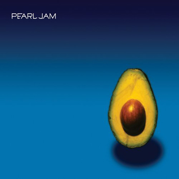
Album: Pearl Jam
Release: 2006
It’s “that Avocado album”! I appreciate the balls this cover has. It doesn’t do anything flashy. It relies on color and simplicity. The blue background really compliments the deeper yellows and darker oak center of the avocado. Aesthetically, it’s well done. The colors complement each other and it draws just enough focus to make it interesting. Still, it’s an avocado. If it were guacamole this whole paragraph would be different. I also can’t help but think about the Andy Warhol designed Velvet Underground banana cover. I just don’t think hipsters and ironic vintage sheep will be wearing the self-titled album cover on their shirt. At least, I kind of hope…
Rating: 5.5
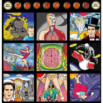
Album: Backspacer
Release: 2009
The latest release proves the band continues to put a special focus on their cover. A lot of bands just start slacking or sticking to easy contraptions by this point. Not Pearl Jam. Then again, the same can be said for their music. Consistency is always good. The art was assigned to cartoonist Dan Perkins. Perkins uses the pen name of “Tom Tomorrow” and is a pretty well respected guy among the business. The illustrations are all beautifully done. I like the general look of it, but each of the panels have their own full story. I also read there are a lot of little hidden things in the design. That’s always fun. As much as I like and appreciate the nine panels, I don’t know if really represents the album and the band at this point all that well.
Rating: 6.5
Which Pearl Jam album cover do YOU like the best?
|

|
| | |