|
|
|

|
|
[MUSIC] THE SAVAGE ANIMAL
"The Album Covers of Marilyn Manson" |
06.27.12 |
BY MIKEY MIGO

As I get closer to 30, I’ve found myself defending Marilyn Manson to my friends and peers more and more. I’ve been a fan since before Antichrist Superstar came out. I fell out of things after Mechanical Animals but the more recent albums have been great. I know a lot of people feel that Manson “lost it” or that they’ve “outgrown” his goth rock scene. For those folks, I say at least give it a chance. I’m a fan of his artwork, I have about a third of a bottle left of his “Mansithe” brand absinthe on a shelf, and his writing and prose is always something I’ve been interested in. Manson has evolved and grown, but I feel in the sense of music that he’s gotten “his voice” back in terms of writing and performance.
The image of Marilyn Manson has been an evolving visual. He has gone from the long-haired dirty goth guy to the antiquated S&M goth guy to the breast-baring alien to evil gothic sophisticate and so on and so on. I think right now he’s just rocking a general “evil goth rockstar” look.
But how about the actual cover of these albums. Let’s take a look at the album art of the eight studio albums that Marilyn Manson has put out. Are they evil art or just marketing gone wild?
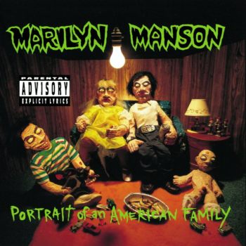
Album: Portrait of an American Family
Release: 1994
This was when Manson was going apeshit and getting a reputation for himself as being crazy. Case in point was the original idea for this album cover. They wanted to use a clown painting by serial killer John Wayne Gacy with the interior being Polaroid pictures of gory stuff. The record label said no. Manson then made the clay sculpture we see on the cover. There are little models of The Beatles on the table next to the lamp. Another interesting fact is that this is the only cover to not feature Manson himself. This cover always creeped me out. At a glance it’s merely “weird”. If you stare at it long enough you realize it’s really disturbing. I assume that was the intention. The cover of the Smells Like Children EP was way cooler than this though.
Rating: 7.0
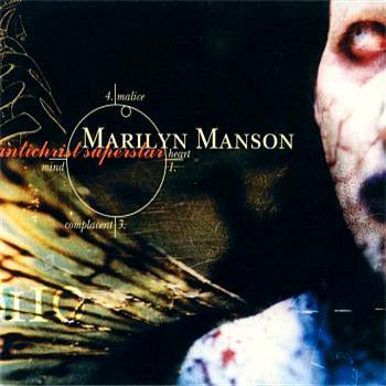
Album: Antichrist Superstar
Release: 1996
The man’s most successful album had a crazy cover. It’s the side of Manson’s face with a predominately black cover. The words are there in a simple font. Other than that is a circle with the worlds Malice, Heart, Complacent, and Mind. Simple enough, right? Well if you fold it you can get “hidden messages” like “Heaven/Comfort”, “Minister/Fiend”, “Complaisant/Magnificent” and “Master/Lice”. On top of that there is a bible reference pertaining to Revelations chapter twelve verses one though five. It just seems so simple, but those hidden messages and it being the iconic cover of Manson’s top album gives it extra creditability.
Rating: 8.0
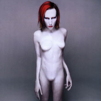
Album: Mechanical Animals
Release: 1998
This cover stirred up tons of controversy at the time. In the late 90’s, Manson went from being spooky goth to being spooky glam. A lot of people will criticize and say this was him trying to rip off the “Ziggy Stardust” idea, but I think he made it his own. The cover is Manson with six fingers, breasts, and no genitalia. He looks like an alien. Manson photographer Joseph Cultice did an amazing job here. There is so much to be said with the colors, the shadows, and the emotion captured. It’s more art than album cover, which should always be the goal. Manson has said in interviews that he traded the prosthetic breasts with actor friend Johnny Depp. In return, Manson got Depp’s blond wig from the movie Blow. That’s more than likely going to be the coolest thing you read all day.
Rating: 8.5
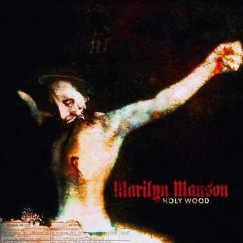
Album: Holy Wood
Release: 2000
It’s an art piece depicting a mandible-less Manson crucified like Jesus Christ. Beneath him is a frayed and ripped portion of the cover. Underneath is a obscured copy of John K. Kennedy’s coroner report. I always enjoyed this cover. It’s got a clear narrative, but the image is so fetching that it almost becomes abstract. It was a narrative against censorship and media martyrs. Ironically enough the cover was censored and people protested it. Point man, Manson… point made.
Rating: 7.5
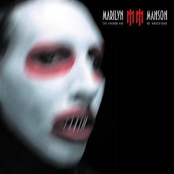
Album: The Golden Age of Grotesque
Release: 2003
The original plan was to go with a Gottfried Helnwein photograph of Manson and a little girl playing with a gun. They didn’t go that route. Instead we get a predominately black cover with a blur smudged image of Manson with what appears to be sewn lips or some other monstrous type of mouth feature. The imagery from this time was inspired by the book Voluptuous Panic. I like the overall imagery he was using at this point. The evil-Mickey Mouse and neo-neo thing he had going on was really cool. I don’t know if the actual music backed it up. Sadly, the cover doesn’t.
Rating: 5.5
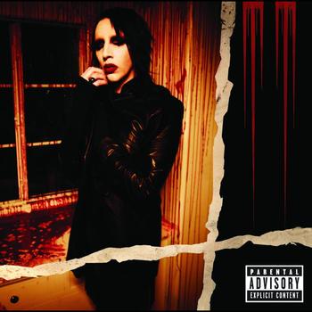
Album: Eat Me, Drink Me
Release: 2007
So this cover is described as Manson as a vampire standing still looking at the camera next to a window covered in blood. How the hell are we supposed to know that it’s a picture of “Manson as a vampire”? Doesn’t he ALWAYS look like that? What about it makes it “vampire-ish” over other covers? Regardless, I like this cover. The image is cool. The darker contrast, the massacre of blood, and the almost-quaint look Manson is throwing at the camera. The ripped graphic going down and across is a little weird, but I dug this “MM” logo a lot. Good stuff.
Rating: 7.5
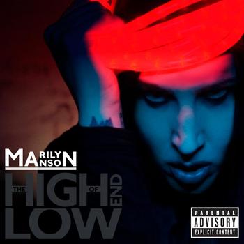
Album: The High End of Low
Release: 2009
This cover never worked for me. I like the color combo, but it doesn’t make me feel anything. It’s just sort of there. It’s Manson holding what looks like red laser lights over his head. He’s blue-ish, the lasers are bright red-ish pink, and there is a firey-toned background. Manson’s expression is distant. I enjoyed the music on this album, but the cover was not on par with the iconography that Manson is famous for.
Rating: 5.0
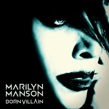
Album: Born Villain
Release: 2012
This is a good cover. It’s a predominately black cover, but it blends with the shadows of Manson’s off-looking face. It’s high contrast and rough looking, but there is still a softer less threatening vibe. I like the aqua blue shading as well. The interesting factoid is that it’s a photograph taken by Manson’s current girlfriend Lindsay Usich. Not bad, but I don’t know how memorable it is.
Rating: 7.0
What is YOUR favorite Marilyn Manson album cover?
|

|
| | |