|
|
|

|
|
[MUSIC] THE SAVAGE ANIMAL
"The Album Covers of Red Hot Chili Peppers" |
08.08.12 |
BY MIKEY MIGO
The Red Hot Chili Peppers are one of the most iconic rock bands of the modern era. They’re up there with the Aerosmiths, the Pearl Jams, and Nirvanas as the best American bands of all time. They were around since before 84, but they wouldn’t have their massive break out until the early 90s. While other bands were breaking out with grunge and distortion, the Peppers were cranking out some of the best funk rock music of all time. I’m pretty sure anyone who has listened to rock music or contemporary music in general knows at least one or five Red Hot Chili Pepper songs.
They redefined themselves over and over again. You can pick any era of this band and find a reason to love them. Each album has at least one or two awesome singles on it and rarely any unsatisfying filler. Like any band, I like some albums more than others but they’re consistent. But how about their album covers? Let’s see…
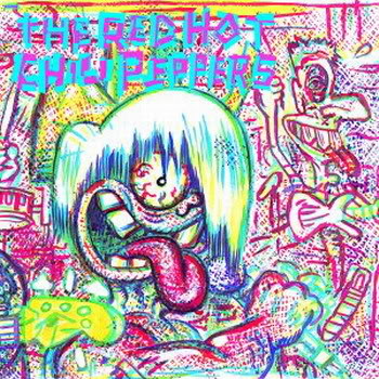
Album: The Red Hot Chili Peppers
Release: 1984
I barely remember hearing anything from this album, but I know I have. Still, I’m not going to front. I don’t recall ever seeing this album cover. It looks familiar, but it’s really cool looking so I think I’d remember it. For the band’s first album they got Gary Panter to rock the cover. He is one of the best in the business and has a really unique style. My favorite work of his was the set designs for Pee-Wee’s Playhouse. That alone makes the man a genius.
Rating: 8.25
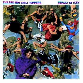
Album: Freaky Styley
Release: 1985
This cover is new to me too. I like it a lot. For 1985, it’s some pretty cool graphic design. It’s the band jumping around in front of Michelangelo’s ‘Last Judgment’. It’s a really energetic and fun looking. If I were an album buying consumer in 1985, I’d give this cover a second look. Another cool fact is that the album was produced by George Clinton from Parliament-Funkadelic.
Rating: 7.5
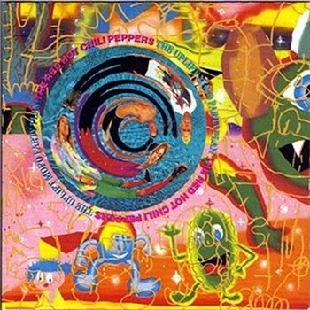
Album: The Uplift Mofo Party Plan
Release: 1987
Here we get the second cover illustrated by Gary Panter. There is a lot going on in this artwork. The band is “spun” in spiral looking shape off-center near the middle. The rest is some crazy animation. It’s slightly unsettling, but at the same time enthralling. Yet, it’s a hard image to still be able to latch onto.
Rating: 7.0
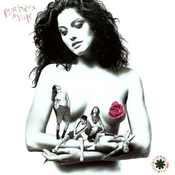
Album: Mother's Milk
Release: 1989
This is still one of the band’s best albums. It’s hard to believe it came out in 1989. There is so much on this album that I recommend giving it a full listen sometime when you get a chance. It holds up strong. The cover is a black and white photo of a topless woman cradling her arms. In those arms is the band sitting around and being their normal zany selves. The only color outside of the text is the reddish hues in the rose… covering her nipple. Grrrar! It was controversial for the times, it is really interesting to look at, and the music it’s representing is top notch. Sure I’m bias, but thumbs up!
Rating: 8.5
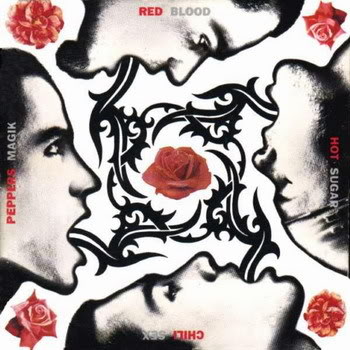
Album: Blood Sugar Sex Magik
Release: 1991
I think it’s safe if I say that we can all agree that this is the band’s best album. I’m not saying we can’t have our own favorites, but this album was pretty damn flawless. The songs we all know by heart are all here. They had success before this, but this has to be considered their breakout. All of the art on this album was done by this guy named Gus Van Sant. For those who don’t know, he’s one of the best and most prolific independent filmmakers out there. At this point, he was on his rise as well. The cover has side profiles of the band members facing each other around a rose. I think this is one of those situations that since the album is so important to their career that the cover is “iconically familiar”. That makes it hard to not be bias, but it still looks pretty awesome. Apparently everything was clicking at this point…
Rating: 9.0
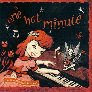
Album: One Hot Minute
Release: 1995
I remember this album for a few reasons. I used to have to always avoid crushing this CD case in the backseat of one of my closest friends back in 99. This album also has “My Friends” and “Aeroplane” on it. Two of the band’s most underrated songs. I know they’ve been played a million times and all of that, but it feels like too many people sleep on them over the obvious picks. This is a cool cover. It’s a drawing of a red headed girl playing the piano while a little fairy or angel or something plays a stringed guitar-like instrument. The illustration is really well done. It’s got a great energy and has a really iconic vibe to it.
Rating: 8.0
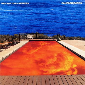
Album: Californication
Release: 1999
This is one of the best rock albums to come out in the past fifteen years or so. They album is pretty much top to bottom awesome. They had tons of great singles and the music on this album is pretty much timeless rock and roll. The cover is just as strong. The colors are awesome. In the background are deep sea blues meeting a horizon line of shrubbery in the distance of a pool full of reddish orange lava looking textures. It’s bold and bright. It’s enthralling and hard not to just stare at and absorb. Great stuff.
Rating: 9.0
Album: By the Way
Release: 2002
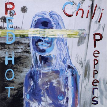
Nice cover. The album itself is solid work too. “Zephyr Song”, “Can’t Stop”, and the title track are songs you really can’t get away from. I’m pretty sure they come programmed into newborns now. This has a cool backstory. Julian Schnabel is credited for the fine work here. The girl is Stella Schnabel, Julian’s daughter and John Frusciante’s then-girlfriend. It’s a cool look. There is a washed out and almost abstract chaos of what’s obviously a woman looking ahead. It’s a pretty nice piece.
Rating: 7.0
Album: Stadium Arcadium
Release: 2006
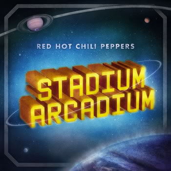
They tried to pull out the big guns for this cover. They got artist Storm Thorgerson to do it. He has done work with Pink Floyd, Audioslave, T Rex, and Muse to name a few. Sadly this didn’t work out. He submitted three different covers and they ended up passing on all three. Thorgerson didn’t like it and made it public. I dunno though. It’s bold, simple, and I think memorable. The big superman looking letters of the album title are featured with a nice space looking landscape and some very understated layout work around it. It’s not mind blowing or anything, but I can dig.
Rating: 7.0
Album: I'm with You
Release: 2011
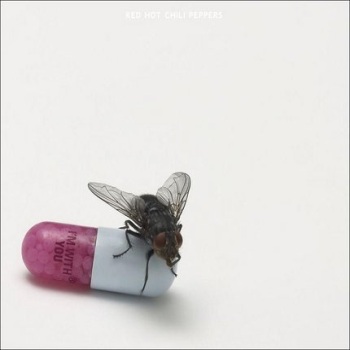
There’s not much to say about this one. It’s a photo of a fly on a pill with the album title casually printed on it. It’s simple and compelling at the same time. It’s designed by British artist Damien Hirst. Anthony Kiedis described it by declaring "It's an image. It's art. Iconic. We didn't give it its meaning but it's clearly open to interpretation." I can’t argue with that.
Rating: 7.5
What is YOUR favorite Red Hot Chili Peppers album cover?!
|

|
| | |