BY MICHAEL GOODPASTER

Britney Spears is a household name. She has had huge hits and big moments and some lows and some bad moments. She seems to have come full circle and has herself together. Her focus and talent is being channeled and she seems to be doing okay. I think we’re all fans of that. I’ve never really gotten into her music. I can appreciate her appeal, but I’ve never owned any of her CDs or went to any of her shows. Her singles and videos are hard to avoid though. I’ve pretty much grown up with her on TV and on the radio. When I was in high school, she was the new teenage pop star. When I was going nuts in my early-20s so was she. When I was going nuts in my mid-20s so was she. She’s still older than me by a year or so, so I don’t feel too bad. It was one of the biggest “right place at the right time” types of things ever. Would TRL have been as big as it was without her or would she have been as big without TRL?
Her image is a huge part of it all. She definitely has vocal talents and dance skills that should be celebrated, but since day one her “image” has been a huge part of it all. Her videos are big events, her hair color and length (or lack thereof) is important to folks, and she is a full on American celebrity.
Sadly, I don’t think the same effort is put into her album covers…
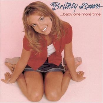
Album: ...Baby One More Time
Release: 1999
For such a huge hit, the album cover is lame. It’s a photo of a teenage Britney, on her knees, looking up and smiling at the camera. It’s a pretty generic photo with a generic pink background with a really cheap looking font. It does not measure up to all of the other Britney content that was coming out at the time. I remember when the album and the huge “school girl” video came out. It blew up huge. And before you get too creepy, you have to remember that Britney was only sixteen or seventeen when this album was released. She instantly became a pop culture hit with this album and her “slightly too naughty, but still wholesome” image.
Rating: 4.5
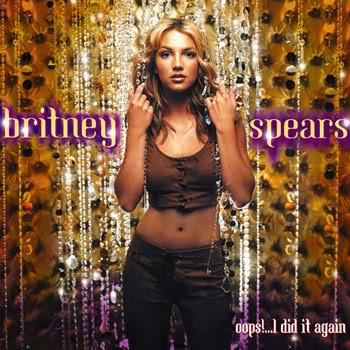
Album: Oops!... I Did It Again
Release: 2000
There isn’t a whole lot going on here, but it’s put together really well. The cover was shot by photographer Mark Seliger. The yellow background with the hanging strips of glowing glass beads (diamonds?) really helps make the subject of the photo, Britney, really stand out. Her clothing is simple, but revealing in a flattering way. It’s not gaudy or cheap, but it’s not as over the top as you’d almost expect from one of the biggest pop albums ever. This is where she really started figuring out who she was. She was interviewed and said "When I did the first album, I had just turned 16. I mean, when I look at the album cover, I'm like, 'Oh, my lordy.'" Indeed.
Rating: 7.5

Album: Britney
Release: 2001
I don’t know what was going on here. Britney sits on what appears to be a porch with a mattress and randomness on it. She sits on the edge of the porch, looks forward, and has a distant look on her face. It’s not so much the photography is bad. Steven Klein definitely took an interesting photo, but the coloring and text is what doesn’t work. The faded out/over saturated look could have worked on its own, but the yellow glow of Britney, the blue-ish background, and the weird “dash” of purple is just lame. On top of all of that, the font is hard to read. There is nothing welcoming about this cover. Who let this slide?
Rating: 6.0
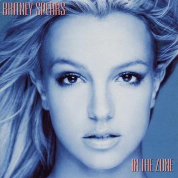
Album: In the Zone
Release: 2003
Do YOU like the color blue? Apparently Britney does, or at least did in 2003. This album cover is interesting, but still a bit lackluster. She has a really alluring look on her face, but that’s about all there is too this. It’s a really tight and almost symmetrical look at her face. The pinkish font is pretty generic as well. I don’t understand this cover either. It does nothing to draw me to it. It looks like a lame early 90’s pop/house music cover. I’m pretty sure this cover might have gotten mixed up with an insert of one of the Ace of Base albums without “I Saw The Sign” on it. If anything, I’m a bit off-put by it.
Rating: 5.5

Album: Blackout
Release: 2007
This cover seems like it may have been the most talked about. At the time this came out it was kind of a big deal because her hair was black. It’s a picture shot by Ellen von Unwerth. She wears a white fedora, has the “shocking black hair”, a pink top, and is in front of a background straight out of a “Saved By The Bell” commercial. The rest of the album art was controversial and hated on by the Catholic League. The cover isn’t that fun. The colors pop, but the font is lame once again. It’s a thin font that gets no favors from the loud background.
Rating: 6.5

Album: Circus
Release: 2008
I think this is Britney Spears’ best album cover by far. It’s not just because she looks great on the cover, and she does, it’s because it’s just really well done. The photography is great and the simple border and star combo just works. It doesn’t go too over the top with a theme, but it has the retro “circus” feel that actually works. And the fonts are finally clear, bold, and makes sense. It’s just casual enough to not be campy.
Rating: 8.0

Album: Femme Fatale
Release: 2011
The most recent Britney Spears album has a modern take on disco, but still keeps it a little too casual. This cover is definitely above-par in the world of Britney albums. It’s a shot of her being seductive and straight forward looking at the camera. It’s bright and mainly white outside of her pale yellow hair and soft skin tones. The only things of real darkness are her eyes and the half-decent font. It’s nothing I’d call “inspired”, but it at least looks like something on the level of her fame and accolade.
Rating: 7.0
What is YOUR favorite Britney Spears album cover?
|