BY MICHAEL GOODPASTER

Beck is someone I respect. I’ve not gotten into all of his music, but I dig the fact that it seems like he does whatever the hell he wants and if it’s considered “commercial enough” for the Top 40 or obscure to the point that only like two people in Indiana know of it. He came to the spotlight in the mid-90’s with “Loser” and the awesome album Odelay and from there would be “that weird guy”. He had some awesome singles with “Loser”, “Devil’s Haircut”, “Where It’s At”, “New Pollution”, and then with “Sexx Laws” and “E-Pro”.
He’ll come in and out of the spotlight, but always seems to have indie cred and critical acclaim. Through his constant evolution of style and influence, he is a man of many different hats. Does this translate to everything? The music and videos? Sure. The album covers? Let’s find out…
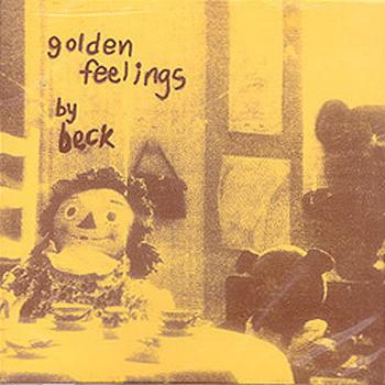
Album: Golden Feelings
Release: 1993
Apparently this album didn’t get a huge release and is a collector’s item now. The cover is of a Raggedy Anne doll sitting at a children’s tea party next to a teddy bear. The shot is washed out and is orange and yellowish. The text appears hand written and child-like. It’s not reinventing the wheel or anything, but it’s a cool shot. You can look at it and be drawn into it. It’s unsettling, but still something you want to take in. Pretty cool.
Rating: 6.0
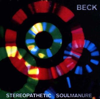
Album: Stereopathetic Soulmanure
Release: 1994
It’s a pretty simple cover. The weird, almost retro science fiction looking rings of color glare and overlap. It is a simple looking image for sure, but that’s obviously what’s being intended. It’s an interesting lay out and the colors are complimentary, but it’s a pretty forgettable cover. Simplicity can work, but not so much here.
Rating: 4.5

Album: Mellow Gold
Release: 1994
The album got out there a lot because of the success of the single “Loser”, but it’s still hard to describe the cover. There is a weird reddish cloud background with some type of “thing” in front of it. It looks mechanical but with some type of monster head with a big horn. I could totally be off on that too. That makes for fun art. If you can stare at it and decipher something different ways then that adds a whole new dimension of merit. I think that happens here.
Rating: 7.0
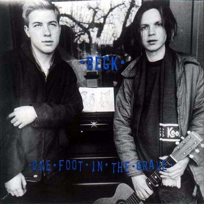
Album: One Foot in the Grave
Release: 1994
This is a cool photograph if anything. It’s a pretty casual album cover. The photo is interesting, but the font is kind of hard to read and is barely there. The black and white photograph is of Beck, looking forward, and James Bertram. Bertram is a pretty renowned bass player and had a bit of cool history of his own. I appreciate quaint and classic album covers like this. It’s not the coolest cover ever, but it’s a captured moment and not without its own charm.
Rating: 6.5
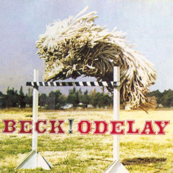
Album: Odelay
Release: 1996
This has to be Beck’s most successful and most acclaimed album. There was tons of great stuff on here and I think really brought a lot of ears to Beck’s work. The cover is cool and sticks with you. It’s a Komondor, a Hungarian dog, jumping over a hurdle. It was a last minute decision to go with this cover, but how could you not go with this dog with thickly matted hair after you see it? It’s almost disturbing, but you can’t look away. I know it’s a dog, but I still don’t feel like I know what I’m looking at. Great.
Rating: 7.5

Album: Mutations
Release: 1998
This is a pretty decent shot. The cover is a photograph of Beck tangled in plastic wrap. The shot was taken by the Autumn de Wilde and is set in a cool washed out grey. I like the lay out. It’s nothing amazing or anything, but it’s just a really solid cover. It has a shot of Beck, the font is clear, and it’s well done and adequate. Yes, that’s the best way to describe this one… “adequate”.
Rating: 5.5
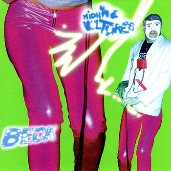
Album: Midnite Vultures
Release: 1999
There is a green background with close-ups of bright pink leather/plastic looking pants. There is weird lightening thing coming from the crotch and seems to meet the crotch of a male figure in the same pants. The face almost looks like a male blow-up doll. I cannot confirm if that is infact what it is. The album has “Sexx Laws” on it and a lot of what I’d called “awkward funk” on it. That vibe is on the cover. It’s a weird abstract-ish looking thing. I think my only subjective complaint is the font and text. If the lettering popped a bit more, it would go a long way. Still, pretty interesting.
Rating: 7.0

Album: Sea Change
Release: 2002
This is a cool cover with a cool concept. Beck put out four different album covers. They all feature the same face shot of Beck, but with different complimentary art work by Jeremy Blake. Others have put out different covers for the same album, but not everyone does a good job with it and makes it worthwhile to the fans. In this case, I like it. The photo and artwork used in the four variations are interesting and worth checking out.
Rating: 8.0
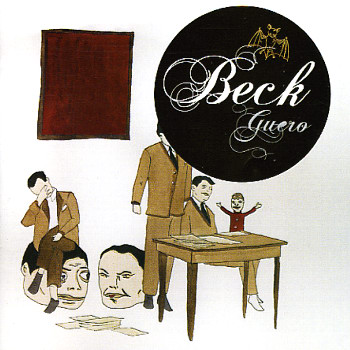
Album: Guero
Release: 2005
Canadian artist Marcel Dzama had the honorable task of rocking this artwork. The art is pretty random and kind of surreal. There is a lot going on. A man sits at a table with what looks to be a puppet, next to him is a man who is apparently being censored by a big circle, and behind them are two heads with a man sitting on one of them. It’s a cool piece that leaves room for a lot of interpretation. That’s always fun in art.
Rating: 7.0
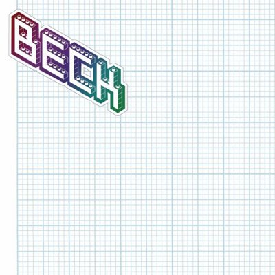
Album: The Information
Release: 2006
This is over six years old and it’s still one of the coolest ideas for an album cover I’ve heard of. The album was released with a blank cover and one of four different sheets of stickers. With these provided stickers the fan can create their own personalized cover. Beck explained he wanted no two copies of the CD to be the same. It’s a cool interactive idea that most artists wouldn’t dare putting out there. I give it points for originality, interactivity, and the fact that it could be ANYTHING.
Rating: 9.5
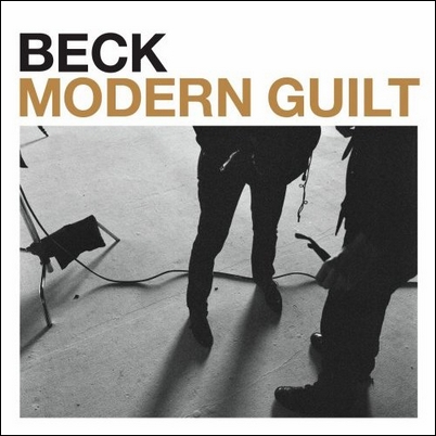
Album: Modern Guilt
Release: 2008
It was a late night and last ditch effort when Beck sent this image over to the label at 2 a.m. It’s just a shot of feet in a recording studio. Beck provided some good insight on this cover. “My engineer, who’s also a photographer, was just testing the camera and took a picture of legs. I think it’s me, and somebody else who was there. And the floor. Everything else was so album cover, you know what I mean? I love throwaway covers. Seems like they did that a lot more in the ’70s. There’ll just be a shot, like, in the corner of the room. You know, it so obviously isn’t a cover that it just makes it a great cover.” I think this explanation is exactly why this is a cool album cover. The white border around it, the simple and bold font, and the casual photo just work. It IS a very cool “throwaway cover” for sure.
Rating: 7.5
What is YOUR favorite Beck album cover?
|