BY MICHAEL GOODPASTER

The Smashing Pumpkins trail-blazed in the early 90’s and represented the Midwest very nicely during the grunge era. They put out numerous hits during their heyday. Once the band started to dismantle a little by little Billy Corgan held it together and kept bringing the hits. The mid-90’s videos were stellar. I can’t think of many music videos that were as breath taking and magical as their “Tonight, Tonight” video. Then we can fast forward to the late 90’s where “Adore” hit the scene. It was darker, more electronic, and eerie. “Machina” gave us “The Everlasting Gaze”, which had one of the coolest breakdown bridges possibly ever.
There is tons of great music, videos, and content from The Smashing Pumpkins we can all dig into and enjoy. They were never a band I sought out every album of, but when I heard a single, saw a video, or borrowed a CD I appreciated the hell out of it. The one aspect of The Smashing Pumpkins I want to look at today is the cover art of all nine albums...
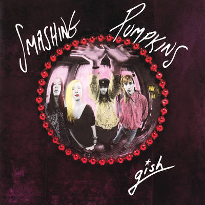
Album: Gish
Release: 1991
The debut cover is pretty cool. It’s classic, simple, and really gets over the vibe of “the times” without being cheesy and dated. The font is simple “handwriting” and reminds me of SNL’s old scratchy logo. The picture is what rocks about this one. When I see a band that looks like they do, wearing what they wear, with the filtered picture looking the way it does I INSTANTLY think of early “pre-grunge” 90’s. That’s not a bad thing, but that few year time period always interested me. Then crushed purple background, the red balled border, and the picture in the middle works.
Rating: 7.5
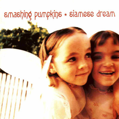
Album: Siamese Dream
Release: 1993
This has to be on the “Top 10 Most Memorable 90’s Album Covers” list (Coming Soon!) The album had tons of hits and the band really broke out with this release. Rightfully so. The exposure of the album made the cover a big deal. It features two conjoined twins having fun outside. In 2007 the band reached out to find these two little girls again and after some time it was said they both, separately met Billy Corgan in 08. This is also where that cool ass font they used for years seemed to start.
Rating: 8.0
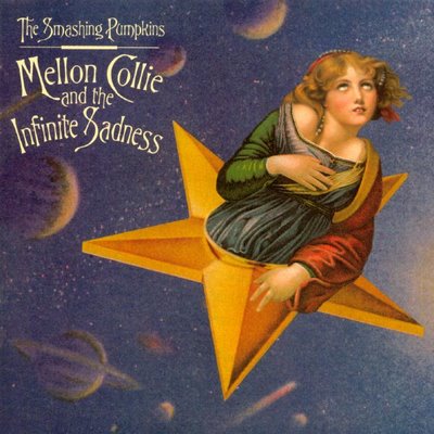
Album: Mellon Collie and the Infinite Sadness
Release: 1995
Just like Siamese Dream, this album was a huge. This double album sold like a billion copies and it’s arguably the best album released by The Smashing Pumpkins. It’s just a grand piece of art. The cover captured the tone with a delicately weird illustrated piece. It’s space and a Madonna-like woman comes out of a star. It’s really well done. The colors are vivid but it still has that old school iconic vibe to it. The font and text layout compliments this all very nicely. Album art like this makes me miss big ass vinyl covers.
Rating: 8.5
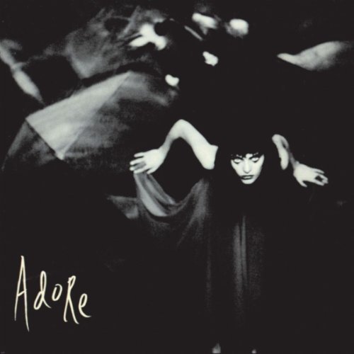
Album: Adore
Release: 1998
For this one, we got a black and white shot of a creepy woman posing and lurking forward. I really dig the photographer’s eye on this one. The look in the woman’s eyes and the “in motion” pose is really alluring and almost seductive. The background is hard to figure out. It looks like an array of sheets or fabric, kind of like webs, or maybe it was shot through a dirty window or a dirty lens. Either way, it supplements the image flawlessly. At this point it seemed the band was going with a darker and more macabre tone so this was perfect.
Rating: 8.0
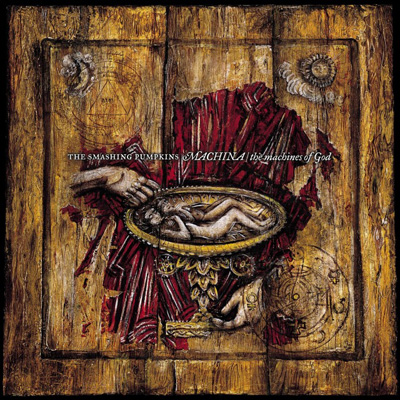
Album: Machina/The Machines of God
Release: 2000
This cover and packaging was nominated for a Grammy. You can understand why pretty easily.
This cover is pretty intense and you can easily spent more than a few minutes taking in all of the artistic madness going on. There was a whole mythos to the go along with this album based on some writings by Corgan. The cover has an offering plate in the middle that seconds as a cup and a womb. Meanwhile it’s said to be Adam and Eve in the middle of this. Hands are above and below the womb plate and then there are subtle layers of information sprinkled and hidden all over. The texture is vibrant and it’s a really solid piece of art. It’s almost too intense to casually encounter. It needs to be taken in and absorbed.
Rating: 7.5
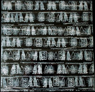
Album: Machina II/The Friends & Enemies of Modern Music
Release: 2000
All of the covers up until this point were artistic, bold, and represented the work it packaged nicely. This album was never really put out there, but was rather released digitally and on the DL. It didn’t garner much love musically and I can’t say the cover does anything good for it either. It’s a black background with printed images layered and overlapping. It’s like a really bad attempt at Warhol-like “pop art” and I love me some “pop art”. I’m just not feeling this one.
Rating: 4.0
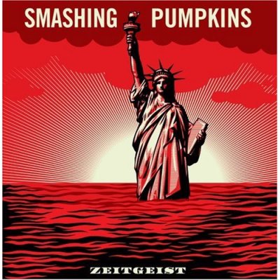
Album: Zeitgeist
Release: 2007
The main thing that was interesting about this cover was the criminal hoopla around it. Angry fans broke in to a studio and stole 39 photographs and three guitar picks. They leaked a few of the images and then got busted. This cover is cool. I’m sure there is some political message with the Statue of Liberty in high waters. The coloring is simple. It’s simply shades of red, white, and black. It’s bold, easy to look at, has familiar imagery and works well. I appreciate the craftsmanship, but it’s just not a memorable cover to me.
Rating: 6.0
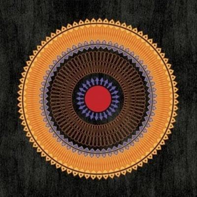
Album: Teargarden by Kaleidyscope
Release: 2009
I dug what they did here. The concept was to deliver the music and art in different ways. One way was with a box set. The cover of the box set (above) is a cool design. It’s a symmetrical circle design with really complimentary colors. There is nothing too crazy or innovative going on. Just solid art. The other method was digital. It’s the same mentality, but a different circle design. Nothing too innovative, but progressive nonetheless.
Rating: 6.5

Album: Oceania
Release: 2012
I like this cover a lot. It’s a photograph of the North Shore Sanitary District Tower in Highland Park, Illinois that was taken by Richard Shay, son of Chicago icon Art Shay. I like the upward angle, the chaos of the empty tree branches, the empty sky, and the deep contrast. Normally it would be cool, but what really does it is the coloring of it. The fade from the greenish teal to the deep blues is really easy to look at. You’re welcomed into the image and given room to fully take it in. Good stuff.
Rating: 7.5
What is YOUR favorite Smashing Pumpkins album cover?
|