BY MICHAEL GOODPASTER

Madonna has been around since 1979. Before that Madonna Louise Ciccone was living in Michigan dreaming of bigger and better things. In the late 70’s she got started but by the mid-80’s she was an established pop culture icon. With hits like “Like a Virgin”, “Papa Don’t Preach”, “Like a Prayer”, “Vogue”, “Music”, etc. etc. etc. It goes on and on. She has done movies, been involved in tabloid scandals, and has had tons of controversy around her. The controversy sometimes comes because of the content of her music, but most of the time it’s because her visuals. It’s been the way she dresses, the way she performs, the way her videos are, and just anything about her image. One aspect of her image that doesn’t seem to get its share of attention is her album covers. For someone whose career is just as based on her image as much as her talent, if not more, you’d think her album covers would rock right? Let’s see!
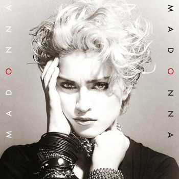
Album: Madonna
Release: 1983
Madonna’s debut album is about thirty years old. This is pretty much an ancient artifact at this point. The cover to this landmark album is a simple black and white shot. It’s a great photograph of her looking deeply and almost menacing into the camera. She has a short cropped up haircut, the wrists full of bracelets, and heavy eye-liner. It’s not quite the Madonna image from the 80’s that comes first to mind, but it works. The font is simple on the side with the only color in the entire image is the red “o” in her name. Not bad.
Rating: 7.5
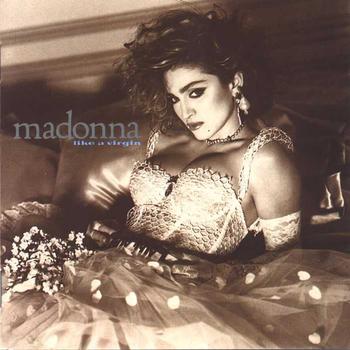
Album: Like a Virgin
Release: 1984
It’s another black and white photograph, but this time with a slight tone to it. Shot by Steven Meisel, Madonna knew exactly what she wanted to convey with this image and worked it like no other. This is also that image of Madonna that most of us think about from this time frame. She’s in the dress, still has a punk-ish look, she’s sexy, she’s serious, and it’s fair to argue that this could have been her best looking time period and most likely her best work as well. It’s just a really good shot.
Rating: 8.0
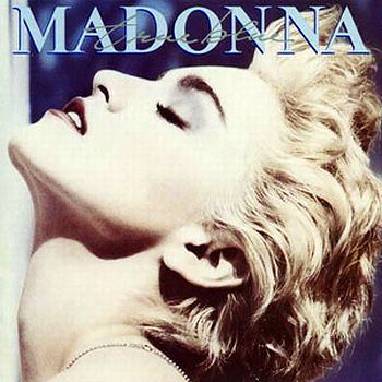
Album: True Blue
Release: 1986
Madonna rocks the short hair in this lavish “neck up” shot. She leans her head back with a very dominate face. She looks satisfied, strong, and graceful all at the same time. The coloring is mainly the paleness of her face and platinum blond hair with shadowy blues in the background. Apparently it was shot in black and white and altered in post. The photograph is great, the style is all Warhol-like, and the result is easily one of Madonna’s best images. Photographer Herb Ritts captured a stunning shot here.
Rating: 8.75
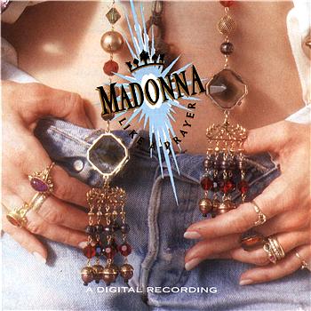
Album: Like a Prayer
Release: 1989
If you’ve seen The Rolling Stone’s album cover for Sticky Fingers then you see this and wonder “Whadupwitdat?!” Yeah, it’s pretty similar. The Madonna show is of her midsection, with hands resting on her jeans. We don’t see all that much skin because of the logo blast over the naval and the big gaudy jewelry. I guess for the time it would have been “provocative” or “controversial”, but its weak sauce for long term appeal.
Rating: 6.5
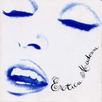
Album: Erotica
Release: 1992
There’s not much going on here. That’s not necessarily a bad thing. It’s a tight shot of Madonna’s “oh face”. The only colors we see are white and shades of blue. The font is sprawled on there and looks hastily laid out. Siung Fat Rjia was the art director and designer on this album. I appreciate his simplistic approach for a very big and charismatic personality like Madonna. It’s simple, but impactful.
Rating: 7.25
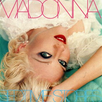
Album: Bedtime Stories
Release: 1994
Madonna is upside down, looking upward with heavy make-up, a nose ring, chopped up blond hair, and simple neon fonts. Yes folks, it’s the mid-90s! She has that whole Drew Barrymore thing going on here for sure. It’s an interesting shot and you can’t help but look at it. Her eyes pull you in to the shot and the soft colors in the background make it easier to absorb yourself into. It’s not her best cover, but it’s not her worst.
Rating: 7.0
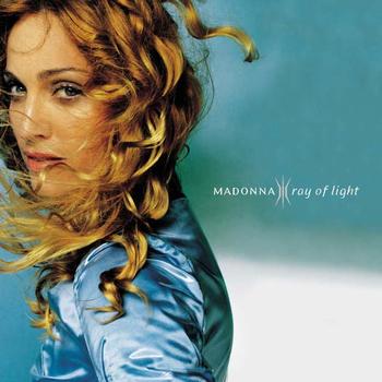
Album: Ray of Light
Release: 1998
I like this cover. It’s not too gaudy and doesn’t seem like it’s trying too hard. Kevin Reagan’s art direction is simple. It’s just a side shot of her looking at the camera in motion or with wind at her back. It’s heavy on blues and her natural tones, but still has a pleasant softness to it. Around this time I recall Madonna getting into more alternative religions and spirituality. Knowing that, you understand the cover just a bit more. The text is small and simple, but clear. It’s not a hugely memorable cover, but a good one nonetheless.
Rating: 7.25
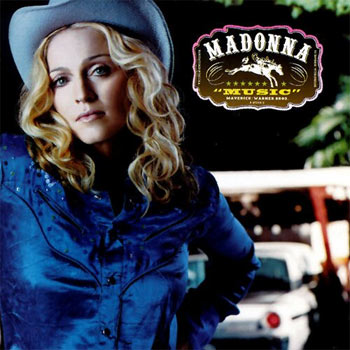
Album: Music
Release: 2000
Oddly enough, this won a Grammy in 2001 for “Best Recording Package”. It looks nice and all, but I don’t see the “award worthiness” of it. It’s a rare shot of Madonna looking face on at the camera. She’s wearing a blue button-up shirt, a blue-ish cowboy hat, and there’s a car and random blurred shit in the background. The interesting part is the logo. It looks like a mock-up for a belt buckle, but lazily colored and put together. I like the deep contrast, the bright colors, and the actual photograph but the logo is off-putting. Really good, but a Grammy? I dunno about that…
Rating: 8.0
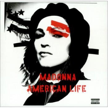
Album: American Life
Release: 2003
A reputable French design team put this together. They’ve worked with a few other acts in the past, but I don’t know if any of their covers got THIS much attention. It was obviously made to make some grand political point and come off as “edgy” and “controversial”. The Che Guevara looking image looks like its “tagged” or spray painted. It comes off as a lame homage to Patty Hearst or something. It’s just not working for me. I know what’s being attempted here, but it’s lame. It’s like a suburban teenage girl trying a little too hard to be “rebellious”.
Rating: 4.5
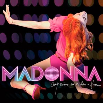
Album: Confessions on a Dance Floor
Release: 2005
Not bad. It’s a obviously a throw-back cover. She’s putting on a disco image this time around. Her hair is reddish orange, pink top, punk shorts, and she’s in low-to-the-ground dance pose. The background is blurred color lights. It’s strange that when this kind of image was contemporary and popular, she was doing her own thing. It’s like she decided to play catch up. It’s a cool visual piece and it pops. Pretty decent.
Rating: 7.5
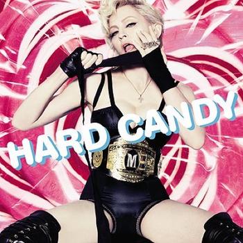
Album: Hard Candy
Release: 2008
I’m a big fan of this horrible album cover. The background of swirly red and white candies is gaudy. Her black clad dominatrix wrestling attire is bad ass. She even has a cool as shit championship belt. Being a wrestling fan, I can honestly say that it’s a very nicely designed belt. If only the WWE could use it for the Diva’s Division. It’s a tacky and laughable cover. The font is silly. I like it a lot.
Rating: 8.5
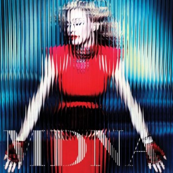
Album: MDNA
Release: 2012
I like this cover for legitimate reasons. It doesn’t spoon feed the typical image of Madonna to the eyes. He spreads outward in a reddish dress with red finger-less gloves. She stands behind a textured glass. It’s leaves a really cool staggered effect that gives off an awesome motion vibe. This is just a visually appealing cover. I don’t know ANY of the music from it, but the art is good.
Rating: 8.0
What is YOUR favorite Madonna album cover?
|