BY MICHAEL GOODPASTER

R.E.M. always felt like a band that was too cool for school. I always dug their singles as much as anyone and had a period where I played “Orange Crush” on repeat for an entire summer, but they were never a band I fully let myself get into. I never bought an R.E.M. album, but probably should have. Their lineage is impressive and I can’t think of anything snarky to say about them. They made good music, were sometimes outside of the box, and always seemed to have a focus be it good or bad. That’s the kind of artist you should have no choice but to respect.
So between the videos I’ve seen, the singles I’ve heard, and the massive amount of tunes I’ve not had the pleasure of absorbing I wonder where their huge appeal comes from. I’m assuming it’s the music, but with any entertainment field you just don’t know. One of the artistic fronts a band can explore is their album cover. R.E.M. was around when actual records were printed as a norm and not a hipster novelty so I expect some quality.
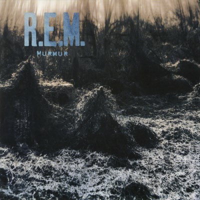
Album: Murmur
Release: 1983
This is a pretty artsy cover. It’s a nature shot with tons of interesting texture and shades. The cover is a local landmark in Athens. It’s now referred to “Murmur Trestle” due to the connection. There were actually plans to demolish the trestle, but there was a public outcry and they voted to save it. This is a pretty decent cover for 1983. It sticks true to their home, but also has a cool artistic image to associate with their album. The photography here is what makes it. The shot is interesting and makes it something you want to look at and take in. I’m sure R.E.M. fans are rabid about this, but I don’t think I’ve ever seen this cover before. If so, it wasn’t memorable. Good shot, but unless I decide to become a super fan this is a cover I’ll forget about before this column is completed.
Rating: 7.0
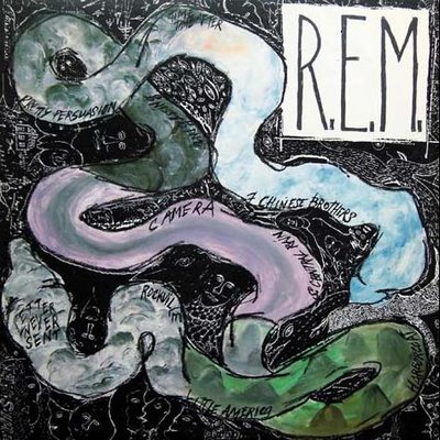
Album: Reckoning
Release: 1984
I like the backstory of this cover. Apparently, Michael Stipe drew a doodle. It was a two-headed snake that he gave to an artist to paint and fill in. Stipe didn’t like the end result because he was attempting to “redefine” the elements. Despite his ambitious intentions, this is still a pretty cool cover. I like the shapes, the textures, and the calming colors of the image. There were some variations to this when it was released in other venues, but the art pretty much remained the same. The fact that no one was ever really satisfied was interesting. The initial cover, despite it not being what was wanted, has its own artistic merit and is pretty cool on its own right. I’m a big fan of how unconventional it was, especially for 1984.
Rating: 7.5
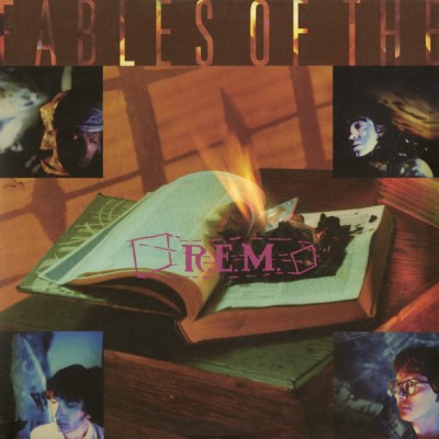
Album: Fables of the Reconstruction
Release: 1985
This is an unconventional cover, but it works. It feels like a cover that represents the 80s. The tones, the colors and the style makes you feel like you’re in a John Hughes or John Cusack movie. It’s a book with what looks to be fire coming from the pages. Outside of that are four squares placed strangely in the corners. These squares are random shots of the band members. They’re interesting shots, but not really the best. It’s almost like they choose these shots based on “I like THAT random one. Yeah, go with THAT.” It just seems “in the moment”. That’s not really a bad thing, but the lay out is just a little weird.
Rating: 6.5

Album: Lifes Rich Pageant
Release: 1986
This is what I’m talking about. Album covers like this are what I was hoping for. It’s a real piece of art. The image is of the drummer Bill Berry on the top part. He’s looking off with a strange look in his eyes in a murky black and white image. Below that is a chunk of an image of two bison. The words and text are over laid on it with a small segment to underline it cut out. Underneath the cut out is what looks to be from the Bill Berry shot below it. So it’s overlapping. And then the last portion is just a slightly darker than normal peach color to balance it all out. These kind of abstract compositions make for some of the best album covers. It gives you something to stare out and fall into. The perception in a cover like this is all depth. There’s plenty.
Rating: 8.25

Album: Document
Release: 1987
This album cover is a lot like the last one. It’s a cool abstract segment collage. The biggest part of the cover is a black and white, blue toned shot of someone setting something up. There is tons of texture and interesting randomness going on. Down the middle is a strip that reminds me of a book binding. It’s black, worn out, and has the album title written down the side. To the left of that is an abstract image with “R.E.M. NO. 5” appropriately labeled. The shots are interesting and I like the balance of colors they went with. You also have to give it automatic bonus points because this is the LP that blesses us with “It’s the End of the World as We Know It”. I don’t care who you are, you’re required by religion, law, and human nature to love that song.
Rating: 8.5
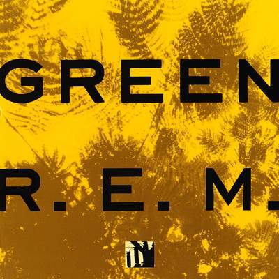
Album: Green
Release: 1988
This one is “edgy” and so “punk rock”. The album is called “Green”, but there is not one shade of green on the cover AT ALL. That’s showing the evil corporations and the jocks, man! I get what they’re up to, but it just didn’t work for me. Not even in a tongue-in-cheek ironic kind of way. I was all ready to dismiss this, but then I read up a little bit on it. It’s an attempt at an optical illusion, which is a totally different story. I guess staring at the orange image for several seconds and then closing one's eyes causes a green negative image to appear. When viewed in this manner, the cover art appears to depict green grass. I feel the dude in Mallrats. I don’t see it. I just don’t see it! The Easter bunny is fake and a sailboat is a schooner stupid head! Ahhh!
Rating: 7.0
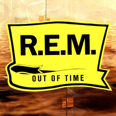
Album: Out Of Time
Release: 1991
R.E.M’s first cover of the 90’s in a simple one. It’s a cool shot of what looks like wavy waters in an orangish/sepia color. On top of that show is a bold yellow “R.E.M” logo. It looks like something you’d find on an oil can in your grandfather’s garage. It’s nothing too enthralling. The band would later have a limited edition release of the album with a fan contest winning oil panting as its cover.
Rating: 6.5

Album: Automatic for the People
Release: 1992
It’s a star ornament that was part of the sign for the Sinbad Motel in Miami. This was close by to where they recorded the majority of the album. The motel remains there today, but the big star is gone. Regardless, I think most people who were into music in the 90’s have seen this cover. The colors, the contrast, and the greys are all interesting. It’s abstract enough that you get something to look at and take in for a few moments. When an image demands your attention like that it’s a decent cover.
Rating: 8.5
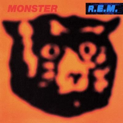
Album: Monster
Release: 1994
Bah. Bah. Bah. Baaaaayside! Saved by the Bell is one of the greatest shows of all time. When I see this album cover I instantly think of the Bayside Tigers. That makes me like it more than I probably should. It’s a cool shot though. The color of the balloon was originally green, but then Michael Stipe told Chris Bilheimer, the artist to “play around with it”. It changed the color and started to retake the picture. To finish up the roll of film he caught a few blurry shots. It turned out that one of those blurry shots was the one they liked best.
Rating: 8.75
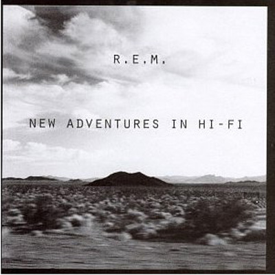
Album: New Adventures In Hi-Fi
Release: 1996
R.E.M.’s tenth album cover is a classy black and white shot. The album has a theme of travel and movement and the cover captures that. It’s a in motion shot of a cloudy desert full of dry vegetation and hills and mountains in the distance. It reminds me a lot of the Joshua Tree artwork from U2 years back. I like the simplicity of just using a simple font and nature shot, but this feels like the cover of a Greatest Hits album for some reason.
Rating: 7.25
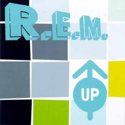
Album: Up
Release: 1998
A lot of folks say this is the world R.E.M. album. Stuff about how the drumming was all done by a machine and blah blah blah. The cover is different. It’s mostly white, but with segmented squares. The squares are colored and the “R.E.M” is in big box letters. It’s called “UP” and there is an arrow pointing up. What else do we need to describe here? It’s totally forgettable, but the layout is interesting enough.
Rating: 6.25
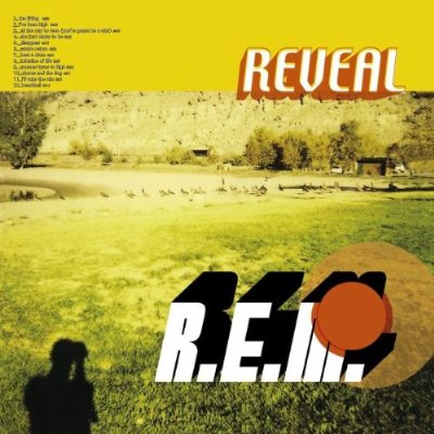
Album: Reveal
Release: 2001
I like how this cover comes off. It’s called “Revival” and it has a big time throwback vibe going for it. The tracks are listed on the cover, it’s a washed out image, and it’s designed to be “retro”. I like it. The colors are bright and overexposed a tad, but it’s visually inviting. There’s a lot going on. The shadow of the photographer, the font, and the intrusive red dot are just a few quirks that make this something easy to look at for a while. Success!
Rating: 7.75
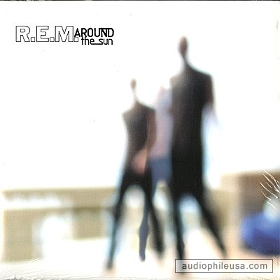
Album: Around The Sun
Release: 2004
Thomas Roman Dozol is the photographer of this image. I’m sure if I researched it, there is a vivid explanation for this. Instead I’m going to respectfully interpret it based purely on what I see. It’s mainly white; there are blurred images of what seems like people walking. I’m going to go out on a limb and assume it’s the band. I like the shot and the balls it took to go with something like that. Not many bands would go with a blurred shot like this. It’s too abstract or random. Well done.
Rating: 7.5

Album: Accelerate
Release: 2008
This is a cool cover. I like the hand drawn feel of it. It has TONS of texture, levels, and things to look at. It’s a black and white drawing of what appears to be sky scrapers and big buildings from an interesting perspective. It seems simple and nothing too elaborate, but the lines and layers give the viewer something to get lost in.
Rating: 8.25
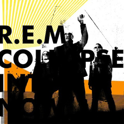
Album: Collapse In To Now
Release: 2011
R.E.M’s final studio album has one of the only covers to actually have a picture of the band on it. They’re all looking slightly off camera and seem to be in the motion of embracing something. I assume Stipe raises his hand to wave goodbye. The yellows, the oranges, whites and blacks complement each other nicely. There is a “digital pop art” thing going on and I like it.
Rating: 7.5
What is YOUR favorite R.E.M. album cover?
|