BY MICHAEL GOODPASTER

I’ll admit to not knowing all that much about The Cure. I know that I’ve always kind of dug what I’ve heard, but it’s just never been a band I’ve latched onto and fully absorbed. The moody new-wave stuff isn’t the problem and neither is the “image” that Robert Smith carries. Those are actually ingredients of acts I’m a huge fan of. I don’t know why I’ve not gotten into them, but it’s probably something I should look into changing. They have a few decades of material so a “First Impression” is out of the question because sitting down for over a dozen studio albums would take up a lot of time. And The Cure has TONS of videos so a “Videography of” is a bit much too. So instead, I’m going to look at the album covers and maybe pick up on some Cure knowledge along the way…
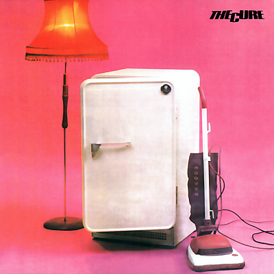
Album: Three Imaginary Boys
Release: 1979
Apparently the label didn’t consult with the band at all when they put this out. This cover is from an “official album”, but it’s still not fair to critique. I like the lay out. We see the pink background, the dingy white fridge, an old school vacuum cleaner, and a tall fringed lamp. It’s a “pop culture” type of attempt, but in the least I appreciate the composition. It just lacks The Cure “signature” that they’d become famous for.
Rating: 6.25
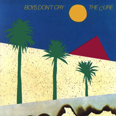
Album: Boys Don’t Cry
Release: 1980
This cover feels dated. The lay out and style is old school graphic design. I like it because of the shapes and lay out, but I can’t imagine any “casual fans” going crazy for the cover and waiting in line for it. Is this even an “official album”? I know a lot of the songs on this one were on the last one, but a few key tracks are added this time out. The cover is actually from a pictogram for a track on the album. That’s interesting at least.
Rating: 7.0
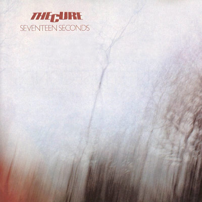
Album: Seventeen Seconds
Release: 1980
The Cure finally got some say-so with this cover. It’s said that this is the first Cure album cover that Robert Smith had a chance to approve of. It’s a really interesting cover, especially for the early 80’s. It’s abstract, but not too surreal. You feel like you can recognize the blurs, but I think it’s just my wishful thinking.
Rating: 7.75
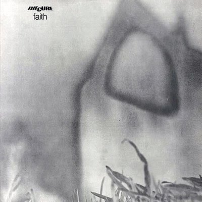
Album: Faith
Release: 1981
I like the deep greys in this image. It’s a picture shot in the fog by former and future band member Porl Thompson. The quaint grass in the front right is at a fun perspective. The layers and contrast otherwise complement each other well. I really like the way this turned out and want to keep looking it. That’s always a good sign of a good cover.
Rating: 8.25
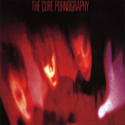
Album: Pornography
Release: 1982
This cover is pretty iconic. I think anyone who knows the band for more than a song or two will know this album cover. There is a blurry over solarized shot of the band. It’s out of focus, stretched out, and super moody. It almost has a strobe light of flash and flame to it. One notable aspect is the fact they ditched their logo, which is probably a good choice moving forward. I think the darker vibe of this cover really signifies what’s to come and what most of us casual fans were exposed to.
Rating: 8.5
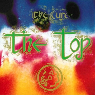
Album: The Top
Release: 1984
This cover is a strange one. It does the job, but it’s kind of sloppy and pretty forgettable. It looks like a cross between 1980’s airbrushing and badly “aged” Celtic typography. The splotchy colors blend nicely, but it’s just that top layer of fonts that suck the coolness out of this. I’d have been way more into this cover if it had no text at all and was just the cool array of colors. Not great.
Rating: 6.75
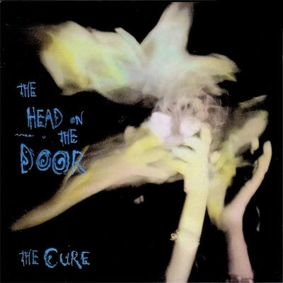
Album: The Head on the Door
Release: 1985
This is an album cover that people should have seen by now. When you think about a band like The Cure, you think about imagery that looks like this. It’s a weird abstract sway of motion that looks like smoke, blur, hands, and just real energy. It feels like someone is reaching for something that is already lively or at least in motion. The black background makes it pop and the blue text compliments it well. I like this cover.
Rating: 9.25
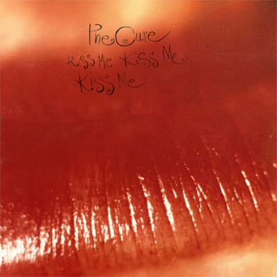
Album: Kiss Me, Kiss Me, Kiss Me
Release: 1987
There’s not a whole lot to say about this cover. It’s a really close-up shot of lips. They’re bright red and shiny. You see the texture of the skin mixed with a fade out of blur. It’s simple, but it works. The font is quietly there, but easily readable to those who don’t get lost in the deep reds of the lips.
Rating: 8.25
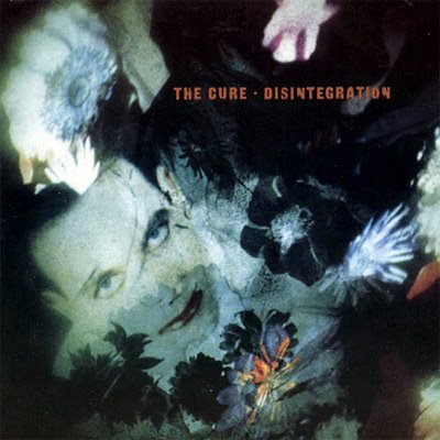
Album: Disintegration
Release: 1989
This cover is pretty iconic. This is a lot of Cure fans’ favorite album. The music definitely stands out, but the cover is pretty damn cool too. I read that Smith was going to switch things up and get a new artist to do the cover. Instead the old crew pops in with a cover with his face as a centerpiece. Yeah, Robert Smith liked it. Why wouldn’t he? It’s not my face, but I think it looks cool. The layering, the exposure of the flowers, the distant bounce of color, and the leering eyes of Smith’s face all just work out. I think the fact that this album is so important to the times that it’s hard to not be a big fan of the cover.
Rating: 9.25
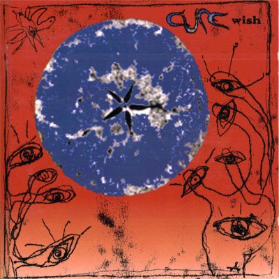
Album: Wish
Release: 1992
I like the colors of this cover, but the imagery is kind of lame. It’s 1992 so I guess it makes sense for the times. The weird sketchy drawing looks like a cross between a weed of blooming eyes or eye-looking alien tentacles. In the center, we’ll assume it’s the Earth. It’s interesting, but not necessarily intriguing. This is probably a “throw-away” cover. I’m sure for diehard fans it’s memorable, but for me it’s something I’ll forget about in like ten minutes.
Rating: 6.25
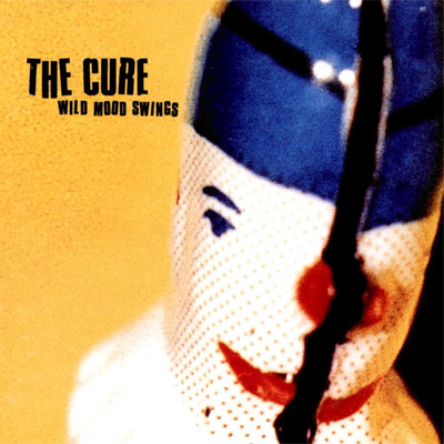
Album: Wild Mood Swings
Release: 1996
This cover stands out compared to the others so far. It’s got a brighter yellow background with a white doll with a blue hat and bright red lips in front of it. I don’t know what the narrative behind it is, if there even is one. I like the color balance of it all. It feels “innocent”, but also damaged a little. It’s hard to decipher, but nothing I’d want to spend too much time dwelling over.
Rating: 6.75
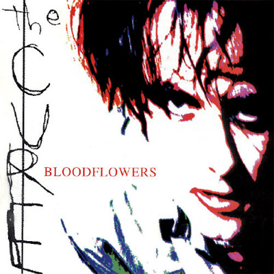
Album: Bloodflowers
Release: 2000
It’s a simple cover, but it’s a cool one. It’s an “intense” looking image of Robert Smith staring deeply at the viewer/listener. It’s all washed out with a heavy take on white along with blacks, reds, purples, and sparse blues and greens. The font of the band name is shoddy handwritten letters. It looks like a kid wrote it or someone wrote it with their wrong hand. Then the album title has a simple Times New Roman-looking style.
Rating: 8.25
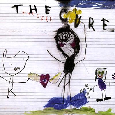
Album: The Cure
Release: 2004
This has to be one of the best and coolest album covers of this entire collection. Robert Smith has his nephews and nieces draw a “good dream” and a “bad dream”. He then took the best of the drawings and had it put into a collage of sorts. Simple as that. Instead of being crafty like others and making their stuff look like a kid drawing to be edgy, it’s as genuine as they come. This is a really cool idea and the different little drawings make for a pretty memorable cover.
Rating: 9.35
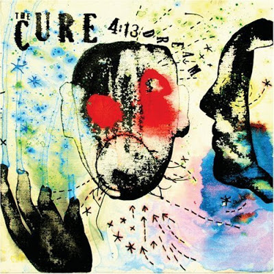
Album: 4:13 Dream
Release: 2008
This is another really cool cover. It appears to be ink and water colors, but I could be wrong. The watery colors flow through out with blues, purples, and yellows. A hand drips down, a side face profile, a distorted front-facing face, and arrows and little stars scattered all over. It’s just fun to look at and well done. It’s an interesting art piece as opposed to just being an interesting album cover used to move more units.
Rating: 9.5
What is YOUR favorite Cure album cover?
|


