BY MICHAEL GOODPASTER

Over the past few years or so it got “cool” to hate on Korn for some reason. I know the whole “nu-metal” genre gets shit on a lot these days by the hipster kids who were just too a little too young to appreciate the genre and just old enough to notice some of the sillier aspects of it. I think it’s a generational thing. The grunge kids hated the hair metal in the same way I guess. It’s all a cycle.
I think one trick to appreciating music is to pick and choose the best of whatever you like and take in the new as it comes. While not all of the music from high school stuck to my musical lexicon, I can honestly say that Korn did. I won’t go out of my way that often to hear Korn, but if it’s on I’ll enjoy them and if my ears come across an album I’ll have an optimistic open mind. Those early albums came out when I was a teenager and it hit all the right the angsty art parts of my young soul.
One aspect of Korn that I always thought was cool was their eye for detail. A lot of bands put out disposable videos and album covers at the time. The themes and a stereotype of a genre and the times become more apparent in hindsight. Looking back and even looking at their recent releases, Korn was never one of those “crank it out” bands. Everything felt thought out, and for better or worse, Korn went the extra mile and tried to make each aspect special and an event. Bands don’t do that all that often anymore.
Today I’m rambling about the album covers of Korn…
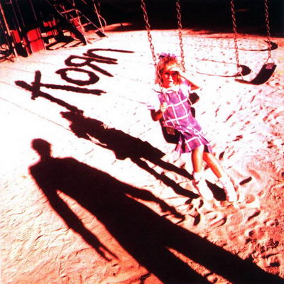
Album: Korn
Release: 1994
This album art would probably be considered too “edgy” for today’s standards. There is too much danger and uncomfortable innuendo. The cover here is a little girl in a Catholic school looking jumper sitting on a swing. She’s squinting upward into the sun, as there is a creepy shadow looking over her. The shadow seems to be holding a horse shoe. Then the band’s logo is in the background as part of the shadows as well. It’s a really creepy cover, but well done. The photograph is interesting and the shadows are impactful. It’s not the band’s most memorable cover, but it’ll haunt you while you’re looking at it.
Rating: 7. 0
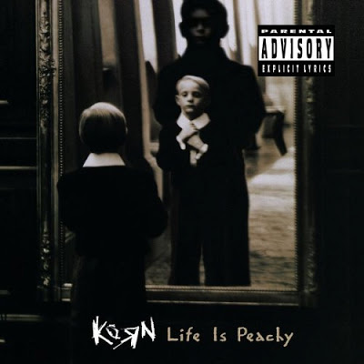
Album: Life Is Peachy
Release: 1996
This is another creepy cover featuring a young child. This time it’s a proper little boy fixing his tie and looking into a mirror. Behind him is a larger person. I don’t know the intended narrative. Maybe it’s that there is a child inside us or maybe it’s just as simple as someone is lurking on the little boy. I guess it’s good that the creepy shadowy figure doesn’t have a horse shoe this time. The photography is really well done. The contrast is deep and the shadows are really moody and eerie. It doesn’t feel as “perverse” as the first cover, but I think it’s just a better shot.
Rating: 7.25
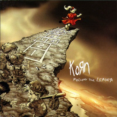
Album: Follow the Leader
Release: 1998
This is a great album with a great album cover. This has to be the band’s most successful outing for sure. The songs on this album are great from start to finish. From this point on, dozens of Korn clones would show up and water down the genre. The cover is done by the AMAZING artists Greg Capullo and Todd McFarlane. Yes, the man who blessed us with SPAWN. They drew an image of a child hopscotching off a cliff with a group of kids waiting for their own turn. The concept is rocktastic and the execution is beautiful. The colors are all pretty neutral with a lot of browns and greys. This all makes the red dress and hair bow of the leaping girl that much of a draw. This gets praise for the actual craftsmanship of the art, but also because of the impact of the actual album. When an album gets as big as this one and has as big of an impact, the imagery attached almost becomes symbolic of a time frame. I’m not saying it’s as “amazing” as the Beatles walking across the street, but definitely part of the late 90’s music iconography.
Rating: 9.25
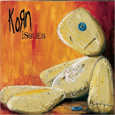
Album: Issues
Release: 1999
This was another really solid album. Lots of hits and good stuff. For a lot of die-hard “old school” fans, this is almost around the point the band lost its way or whatever that means. For the longest time I hated this album cover. It wasn’t because it wasn’t good, it was because of spite. As a dumb teenager in high school I actually entered my own submission to be the cover of this album. Korn and MTV teamed up for a design contest where fans were encourages to submit. Artist Alfredo Carlos won with this design. Now that the scars of losing have healed, I can say this is a really cool piece. It’s a worn out and beat up doll laying in distress. The colors are great. The oranges and reds of the background look cool on its own, but then the actual doll is really well done. The little casual details of the wear and tear rock while it gives off the vibe of inviting sadness. I guess that’s a way to describe the music too on this album so it works well.
Rating: 8.75

Album: Untouchables
Release: 2002
This album never really worked for me. I was still a big fan at this point, but there wasn’t much about it that I connected to. Around this time I was getting more into bands like The Strokes. The cover features a whole bunch of children looking creepy and forward at us. They all look beat up, tired, worn down, and like they’re one moment away from turning into zombies. The hues are mainly brown and in a sepia tone and the title of the album is in scratchy red lettering. It’s a creepy cover, but it’s nothing too awesome. It’s almost creepy to the point of it being unappealing, but not creepy enough to be frightening.
Rating: 6.75

Album: Take a Look in the Mirror
Release: 2003
I really liked this album when it came out and the cover is bad ass. Conceptually, it’s simple and to the point. The album is called Take a Look in the Mirror so the cover has a creepy mirror. It’s a black and white image and it’s a great shot. The mirror has a really cool design and the depth is outstanding. There is not a whole lot to ramble about here. It’s just a really good shot with tons of detail to take in.
Rating: 8.75
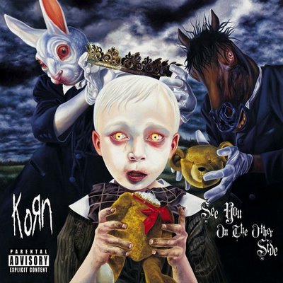
Album: See You on the Other Side
Release: 2005
There wasn’t too much about this cover out there other than it’s a piece by David Stoupakis. It’s a damn fine piece as well. There is a lot going on here. There is a sickly looking child looking forward and I think holding a headless teddy bear. An evil horse-man creature lurks behind the child while holding the head of the bear. On the other side of the creepy child is a rabbit-man creature that is either lifting a crown onto the creepy child or is lifting it off. The background is a stormy sky of dark blues. I love the colors and the imagery is cool as hell. No pun intended, but this may be the “dark horse” of the album covers of Korn.
Rating: 9.25
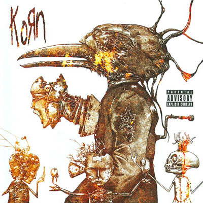
Album: Untitled album
Release: 2007
Richard A. Kirk is the man responsible for this incredible ink drawing. The sepia tint was added afterwards, but it’s still a great image. It’s a bird creature with a robotic head, wires and cranks coming out of it. Around it is three smaller little creepy characters with long arms and odd heads. I don’t think I remember much about this album. I know I never owned it and without looking I couldn’t tell you any of the singles off of it. All I remember was that Korn had an untitled album. That’s a shame too because the artwork here is cool as shit.
Rating: 8.25
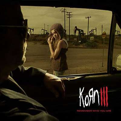
Album: Korn III: Remember Who You Are
Release: 2010
This was the band’s attempt to reinvent themselves while getting back to their roots. I don’t know if that mission was successful, but I do remember being a huge fan of this album when it first came out. There was some really good stuff on here. The cover is awesome too. It’s another creepy shot, but it has a lot going on. There are oil drills in the background with a little girl looking over her shoulder at an approaching male figure in his car. It’s a simple photo and it reminds me a lot of the self-titled cover in general theme and creepiness, but there is a lot more depth.
Rating: 8.0
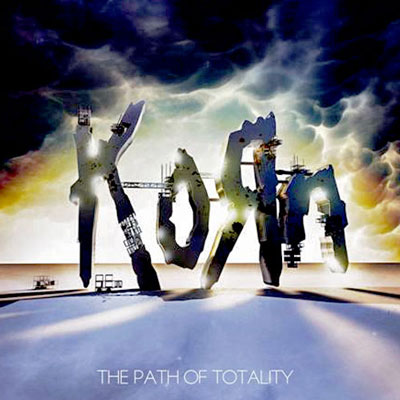
Album: The Path of Totality
Release: 2011
The band’s most recent album cover is easily their worst. That said, it’s not horrible. It’s just too simple for what we’re used to with the band. There is a horizon with what looks like little things set up in the distance. Then really big and coming from the stormy sky is a cybered-out version of the band’s text logo. It’s a nice graphic design, but unappealing in the artistic front. It’s just there.
Rating: 5.0
What is YOUR favorite Korn album cover?
|