BY MICHAEL GOODPASTER

Michael Jackson is the “King of Pop”. I don’t care if you hate him for what you’ve been fed as his public persona. I don’t care if you think pop music sucks. I don’t care if you think Prince is/was better. As interesting and controversial as the man’s storied history was, Michael Jackson is and will always be the “King of Pop”.
He released some of the most successful albums of all time. We all know the words to the hit singles and love digging deep into the vault to hear the old B-sides and tracks we forgot about. I’ve forgotten more facts about Michael Jackson than I’ll ever know about some United States presidents. Despite the fact I consider myself to be a fairly bright guy who knows a little about a lot of various topics, but I know for a fact that I’m not alone in that. I know that says A LOT about the American education system, but it always says a whole lot about the impact Michael Jackson had just by existing and sharing his art with the world.
I don’t need to sugar coat this. It’s Michael Jackson. I’m from the same area he and his family grew up in and I’ve always had a place in my heart of the music and joy he brought to the table. You have your opinion of the man and that’s you’re right, but the music and art is what I want to get into. We know the words to his songs, we know the dance moves from the videos, and we all have tried to moonwalk at least twice in our lives.
But what about the album covers? So much focus and detail has been put into every aspect of this man’s career that I wonder if that rolls over to the album art. I can already think of a few covers just off the top of my head of his that are iconic. Today we’re going to look at the album art of the ten studio releases of Michael Jackson.
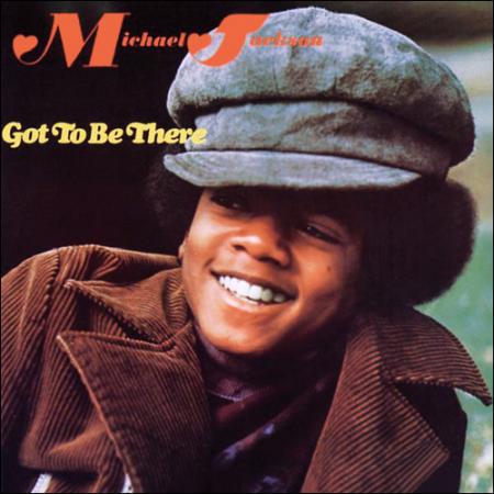
Album: Got to Be There
Release: 1972
After years of tearing up the pop world with his brothers, Michael’s first solo album was a pretty nice starting point. “Rockin’ Robin”, “Got to Be There”, and “Ain’t No Sunshine” stand out just off the top of my head. The cover is simple. It’s a photo of a young Michael Jackson, with a lean and a smile. He’s decked out in the wears of the early 70’s and the photo is pretty to the point. The text is kind of just there and the name is almost hard to read. The hearts on the name font bother me. The way they did it, it could be “JMichael Jackson”. Not good. It’s a good photograph, but the layout makes it lackluster.
Rating: 5. 0
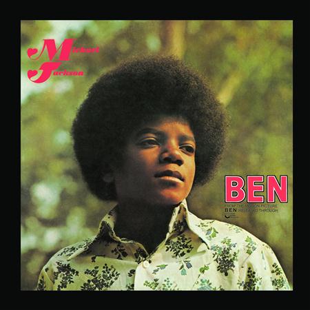
Album: Ben
Release: 1972
I never knew the weird “JMichael Jackson” heart font would be a recurring nightmare. I like the boldness of the “BEN” on the front and the lay out this time out is much pretty presented. The photograph is kind of pimp. Michael looks like a bad ass. The out of focus nature background works well with the shot of Michael looking off in the distance. It’s still a bubbley enough for girls to swoon over, but it’s got some spine to it. The kid on the cover of this album looks worn out and pissed off. Tracks like “Ben” make more sense if take all of this into consideration.
Rating: 7. 0
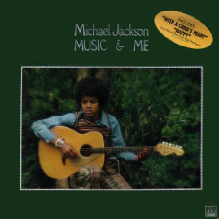
Album: Music & Me
Release: 1973
This cover is straight out of the 70’s. The lay out, the font, the coloring, and the imagery is pretty much standard fare. In the many resale and thrift shops I’ve been in, they have boxes full of albums with covers that look like this but with different colors and different faces. It’s almost like a template. The album itself is one of the Michael albums that people seem to sleep on. This was a really interest point in his artistic development. He’s in that awkward teenager phase. You can see it in the discerning look on his face in the picture and he’s holding a guitar so that makes him even more “mysterious”. I like this cover because it makes me think about thrift stores, but it doesn’t say much for the actual creativity of the cover. Like I said, it’s like a template.
Rating: 5. 5
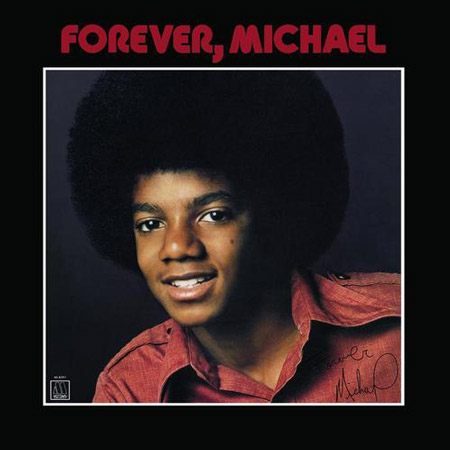
Album: Forever, Michael
Release: 1975
Is it weird that this cover instantly made me think about Metallica? I think it’s the boldness of the black border, the white framing, and the red font. It’s just a strong design layout. The photograph of Michael looks to be his headshot autographed “Forever, Michael”. It’s not that flattering of a photograph. He just looks a little awkward and uneasy. I guess the CD version cropped the border off, which would make it even the weird photo even MORE in your face. He almost looks nerdy. I don’t think that’d be the goal of the designer/photographer.
Rating: 6. 25
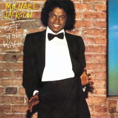
Album: Off the Wall
Release: 1979
Here we go! This album cover is awesome. It looks like a snap shot you’d see backstage at a SNL taping. Michael looks happy and to be having a good time. He’s in a tuxedo in a playful pose in front of a brick wall. The font is kind of awesome. It’s a scratchy look that almost has a “graffiti” look to it. It also helps that this is one of the best albums of Michael’s entire discography. It’s hard to hear this album AND see this cover and not feel good.
Rating: 7. 5
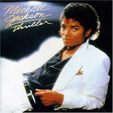
Album: Thriller
Release: 1982
This is one of the most iconic albums of all time, thus this image is embedded into pop culture forever. The music, the videos, and the craze this album caused was unheard of. No one has touched that kind of magnitude. I love the quote J. Randy Taraborrelli had for the phenomenon, "At some point, Thriller stopped selling like a leisure item—like a magazine, a toy, tickets to a hit movie—and started selling like a household staple". It’s true. It’s a black background with Michael chilling on his side in a white suit jacket and pants. The text portion is still a little weak. The signature is clear, but the word “Thriller” is a bit scribbled. If it weren’t obvious Thriller or if I grew up under a rock, I’d have to look twice to read it. He gets away with it because of how iconic it is. You see this cover and tons of sounds and visual memories come at you. It’s not the best picture of Michael Jackson and the lay out and font isn’t even that great. It’s still hard to give it a low score. This is one of those very rare cases where this album cover transcends “art” and goes into an area of being a “symbol”.
Rating: 8. 5
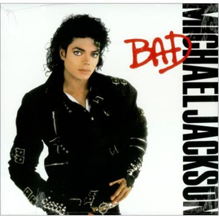
Album: Bad
Release: 1987
This is a cool cover. Michael is looking really serious in his black jacket. The background is white and the name and title is clearly there in their respective bold fonts. It’s a bold design and a no-bullshit lay out. The songs on this album saw Michael getting a little more aggressive and angry. The singles on this masterpiece are among his best. As a kid, I loved this album more than any of his others. “Thriller” was epic, but this album felt more explosive. It was like Michael had something to not just say in his art, but something to prove. It’s not the best shot of Michael, but with the font, the focus, and the attitude I can’t hate on it too much.
Rating: 7. 75
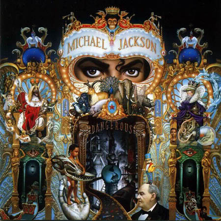
Album: Dangerous
Release: 1991
This album cover is pretty much art. I’m a bit bias towards this release because it’s the first release of Michael’s that I remember anticipating and going out and buying it with the assistance of my parents. I was just getting into music and forming my tastes at this time so this album got TONS of play on my crappy cassette players. It’s not his best album musically. There are some great singles on it, but it’s not as epic as his prior releases. Michael’s tone seemed to shift to more snarky than the balance of being pissed off and playful. That said, this is my favorite album cover of Michael Jackson’s great career. Artist Mark Ryden took months putting this masterpiece together. It’s pretty much a collage of symbolist imagery that reflects who Michael Jackson was at the time. It’s like a one big circus that’s going at full force inside of Michael’s head. There is TONS of little hidden things in this cover that have obvious and not-so obvious meanings behind them. I like that. When you can listen to an album and spend more than a song or two taking in the album art then you’re not just getting to hear music, but you’re getting an experience. Such a cool piece!
Rating: 9. 5
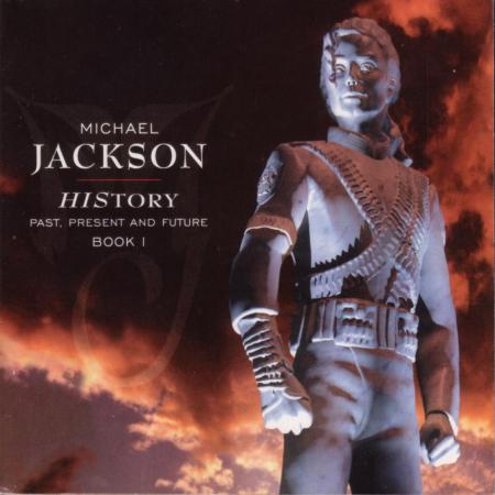
Album: HIStory: Past, Present and Future, Book I
Release: 1995
This album always rubbed me the wrong way. I don’t know what it was. A few of the singles rocked, but it just didn’t have that big of an imprint in my musical lexicon. The cover is pretty interesting. It appears to be a statue of Michael Jackson erected in the orangish clouds of the sky. The image of Michael like a statue isn’t cool. I like the cloudy background and eve the simple and classy font but the shot of Michael, the subject of the image, is weird looking.
Rating: 6. 5
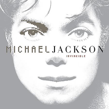
Album: Invincible
Release: 2001
Michael Jackson looks like an anime character here. The weird pixilation of his eye is interesting gives the art something to take in. It’s a subtle cover, obviously, with the faded out and simple shot of Michael’s face. It just doesn’t pull you in. It feels more like a perfume ad than a cover for an album by one of the most successful artist of all time. The image is dull and that’s fine, but it feels dull and that isn’t.
Rating: 5. 25
What is YOUR favorite Michael Jackson album cover?
|