BY MICHAEL GOODPASTER

Van Halen stopped being Van Halen when David Lee Roth departed the band. I know the family name is involved and the other dudes in the band are real Van Halens, but who cares? The name “Van Halen” is a band name, a brand if you will. The best that brand has ever been was when DLR, the Van Halens, and Mike Anthony were tearing it up with their bad ass 80’s hair rock hits. These songs were timeless, had balls, and had more charisma and personality than any other band maybe ever. I don’t think they get credit enough for that. For a while these guys were the biggest and best band in the world. They had nothing put upswing upon them and then it just ended. After Diamond Dave left the scene, the band picked up Sammy Hagar. It didn’t suck or anything, but it just didn’t feel like the same band. It’s a totally different vibe and style. The Red Rocket version of Van Halen somehow sounds more dated than the Diamond Dave version like a decade prior.
Then Gary Cherone came in and blew our minds.
Said no one. Ever.
Anywho, these guys are famous for their music, their personal dramas, their charisma, the videos, the shows, and for a lot of things. But no one ever brings up Van Halen album covers. Is there a reason for that? Do they suck or is everything else just so amped that it’s a slept-on feature?
Today, we find out!
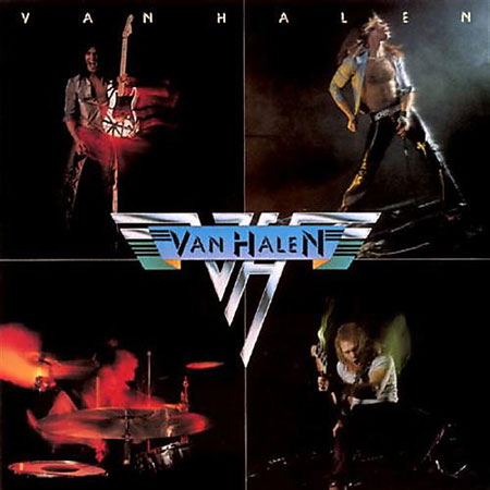
Album: Van Halen
Release: 1978
This is the first one. The cover is made up of photos that were shot at the Whiskey-a-Go-Go, which makes it cooler than it appears off the bat. The band is all doing their thing in classic poses with just enough motion blur to give it a lively and organic feel. The famous Frankenstat Guitar is on there with Eddie. I had the pleasure of seeing it in the Smithsonian a few years back. I really dig this cover. It seems simple, but it’s a really nice collection of shots. Eddie is posed, but the rest of the shots feel like we’re capturing something rock and roll. The typography is simply at the top, but it’s a self-titled album so it slides.
Rating: 7. 65
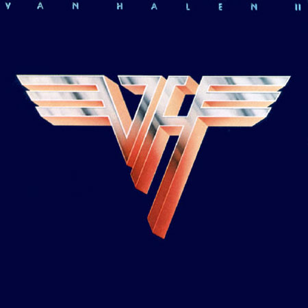
Album: Van Halen II
Release: 1979
This album art is simple as hell. It’s unflinching blue background with the classic Van Halen winged logo in metallic greys with an orangeish highlight. The typography is virually the same as the first album, but easier to digest with the boldly blank background. It’s laid out nicely, and the colors are complimentary, but it’s just lacking anything really impressive. This is a boring cover no matter how optimistically you look at it.
Rating: 5. 15
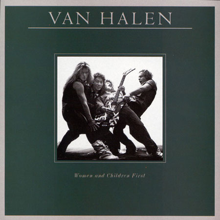
Album: Women and Children First
Release: 1980
This cover is pretty solid. I like the green background with the silver typography a lot. The band’s name is bold in it’s almost Times New Roman font. The album name is a little itchy to reach, but it comes together nicely. I really like the silly and playful shot of the band in the square in the middle. David Lee Rock has that crazy “look at me” look on his face as everyone else seems to be hamming it up for the camera. A single drum would have made this picture even more amusing. Still, it comes together nicely.
Rating: 7. 35
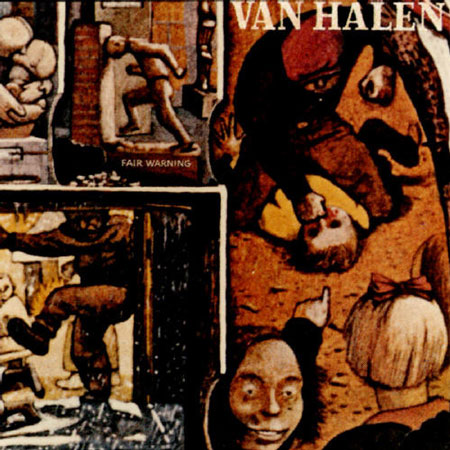
Album: Fair Warning
Release: 1981
This is an album cover that you have to get pretentious about and call “album art”. It’s just that good. Canadian artist William Kurelek’s “The Maze” is a great piece. It depicts his tortured youth so that’s an interesting thing to absorb when looking at it. I like the colors, the near abstract story that is obviously painful but in its own “be your own pain” like of way. The face in front that’s pointing at the kid getting punched is haunting and stands out but there is a lot of details to take in in this piece. Nice work!
Rating: 7. 70
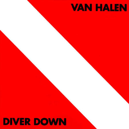
Album: Diver Down
Release: 1982
This is as bold of an album cover as you’re going to find. It’s the “diver down” flag that the US uses for SCUBA related things, but David Lee Roth had his own take on it saying "there was something going on that's not apparent to your eyes. You put up the red flag with the white slash. Well, a lot of people approach Van Halen as sort of the abyss. It means, it's not immediately apparent to your eyes what is going on underneath the surface." I like the reasoning behind it. It’s almost visually jarring but challenges you to take it in. Strong cover.
Rating: 7. 55
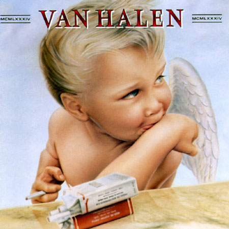
Album: 1984
Release: 1984
This is a really iconic cover. The Times New Roman looking font is at the top with a smokey red thing going on. It doesn’t flat out say 1984, but uses classy roman numerals next to the band name. The actual art portion is outstanding. It’s a baby angel looking off camera with a playful smirk while smoking a cigarette. You know it’s not a one-time smoke because there is two packs there and you just know that baby angel is smoking two packs a day. The colors, the texture, and captured shot are very nicely done. This is album art you’d want to hang up on your wall. Then we add the iconic factor to the mix. This was the cover of one of the band’s very best albums. It’s in the collection of millions of people and the cover has been stared at for hours on end by awe-struck fans. What can I say? It’s 1984.
Rating: 9. 65
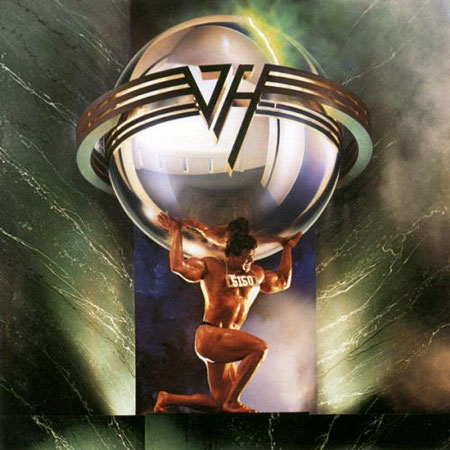
Album: 5150
Release: 1986
This album cover reminds me of Bills and Ted’s Excellent Adventure pretty hardcore. I love the movie so I’m not bothered, but it just has that retro-futuristic rock and roll 80’s vibe. The cover here is a take on Atlas. It’s a famous bodybuilder holding up a sphere made up with the Van Halen logo on it. It’s a cool idea for something coming out in 1986. The color is nice, the concept is interesting, and it’s pretty decent. Nothing too amazing, but it’s at least got its own unique identity. No one is going to mix this up with another cover. That’s for sure.
Rating: 6. 21
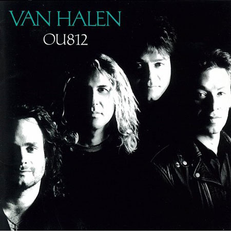
Album: OU812
Release: 1988
This is where things got depressing. This album cover looks like a lot of other album covers. It’s that black and white “half face in the shadows” looking shot. It’s well done for what it is, but it’s just nothing special. They say it’s an homage to the old Beatles cover, but it’s just kind of lame and forgettable. The composition is nice though and I like the teal font color used in contrast with the black and white shot.
Rating: 5. 25
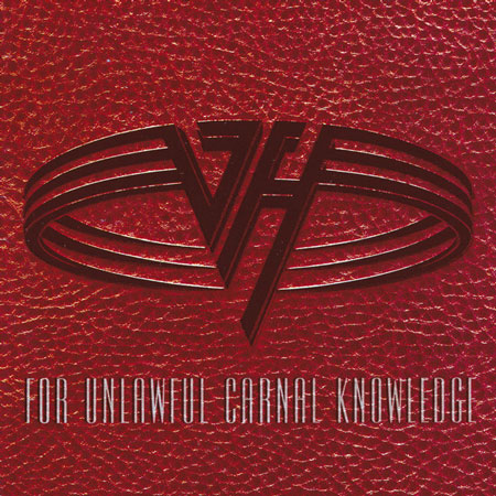
Album: For Unlawful Carnal Knowledge
Release: 1991
I remember this cover as a small child. I remember it being “sooooo controversial”. The title is an acronym for fuck. Oh, how fucking edgy?! That’s showing “the man”! The font is a thin hard to read font on top of a basketball/leathery looking red background. Above that is the band’s updated logo. I like the logo a lot, but the color and composition really kind of suck. There’s nothing about this album cover that would make me want to hang it on a wall or look at it while listening on headphones.
Rating: 4. 25
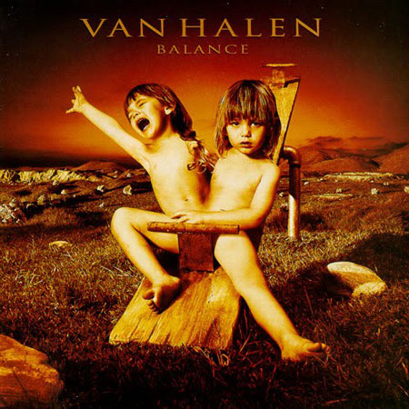
Album: Balance
Release: 1995
This cover is a bit disturbing, but it works. This is a really cool looking and well done album cover. The orange, red, yellow, and almost sepia-like tones stand out and give a cautiously warm tone. The cover is of Wolfgang Van Halen as a toddler altered to look like a conjoined twin. It’s a really well done piece of design work. It was so well done that it actually offended people and was banned in some countries. It’s nothing offensive specifically; it’s just unsettling and eerie. That’s good art!
Rating: 8. 95
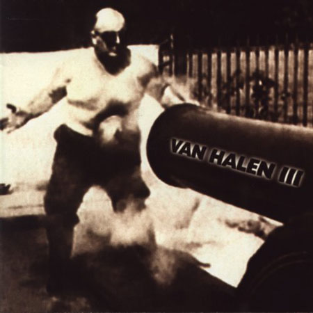
Album: Van Halen III
Release: 1998
The image choice is interesting and cool. It’s a shot of a can getting shot in the belly by a cannon ball. It’s a still shot from stock footage of famous Frank “Cannonball” Richards from way back in the day. It’s an interesting shot. It’s slightly out of focus and the contrast is washy. I like the imperfections and the action. It all makes for a perfectly respectable album cover. The problem here is the typography. The lazy font and lay out of the words just suck. It seriously ruins what could have been one of the band’s coolest covers.
Rating: 6. 25
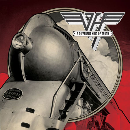
Album: A Different Kind of Truth
Release: 2012
The band’s most recent album cover is a return to the old school logo. David Lee Roth was behind the concept. It’s a steam locomotive shot by photographer Robert Yarnall Richie. The designers wanted an interesting angle and this one looks like it’s coming at you and you need to move out of the way. The red background with the circle stand make it even more “in your face” as it really does pop out. It’s not the best cover ever, but it’s an interesting visual and done in way where it needs to be stared at and absorbed. For a 2012 album cover, you gotta take what you can get. Not bad at all!
Rating: 7. 25
What is YOUR favorite Van Halen album cover?
|