BY MICHAEL GOODPASTER

Common is one of the most talented people out there right now. Coming up from Chicago, the man has become one of the biggest and most respected names in hip hop and is rapidly becoming a damn good actor. He just has his shit together and continues to produce quality. I'm not going to pretend to be the dude’s biggest fan. I've always appreciated his singles and music when I’ve heard them. The truth of the matter is I can name more acting roles of Common than songs of Common.
Despite my ignorance to the majority of his work I know he's talented and he grew up like 25 minutes away, but he's just someone I missed the boat on. He has come a long way since rapping local as Common Sense. He's now one of the most beloved figure heads of hip hop. This didn't happen overnight. Common has released nine albums. Today we check out the evolution of Common's album art.
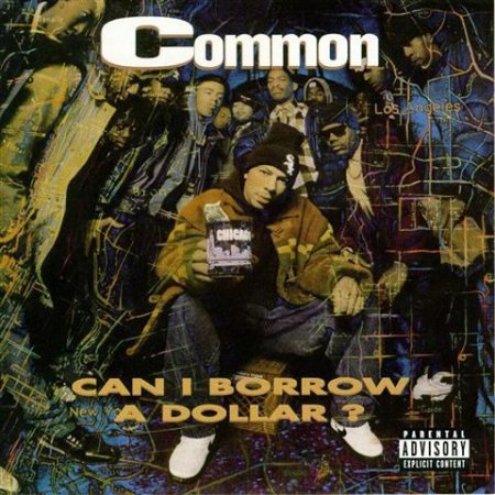
Album: Can I Borrow a Dollar?
Release: 1992
This is a really cool album cover. On the surface it looks like a typical early 90’s rap album cover with a bunch of intimidating dudes, at least a few with hoods and a sunglasses, huddle around the lens. We see that here, but it’s the subtext that makes it so cool. We see two subtle maps surrounding Common, one for LA and on for New York. Being a Chicago rapper he was obviously stuck in the middle at the time. Getting fair attention and distinguishing an identity for the Midwest was no easy task. I like the thought behind this cover, but the execution is a bit cluttered. The album title font doesn’t pop enough to stand out. It just sorta blends into the chaos. Still impressive.
Rating: 8.25
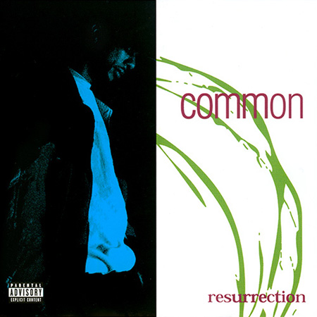
Album: Resurrection
Release: 1994
This is a nice simple album cover. It’s one half with a black background with an overexposed and washed out blue shot of Common looking downward and the other half is a white background with a green splash beneath simple red fonts displaying the artist and album title. There isn’t too much flash going on here, but it’s still an engaging piece.
Rating: 7.0
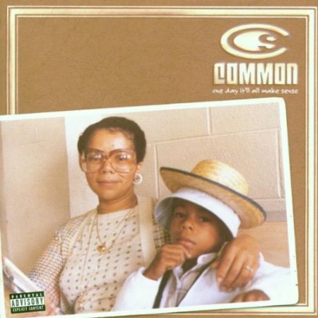
Album: One Day It'll All Make Sense
Release: 1997
Everyone loves their moms, especially soulful rappers. This cover is an awesome showcase of just that. Here Common is 8 years old, wearing a hat or two, looking all thoughtful. The lovely woman with her arm around the young man is Dr. Ann Hines, Common’s mom. The shot is from the two being a Jamaican airport in 1980. The photo just kinda lays there on top of a nicely designed photo album looking lay out. The colors used compliment the old school feel of the picture and the logo and lay out is clear and sharp. It doesn’t seem like a lot is going on here, but this is a well laid out cover.
Rating: 7.75
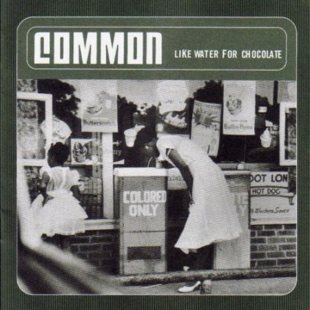
Album: Like Water for Chocolate
Release: 2000
I always thought this was a cool cover. It might have been the first album cover I remember seeing of Common’s on the store shelves. There is an obvious message and narrative here. It’s a photograph, 1956 Alabama by Gordon Parks, of a young black woman in Alabama, dressed for church, and drinking from a "Colored Only" drinking fountain. It’s an impactful shot for sure, but I like the overall package. The green texture and white borders and font really complement each other. This looks like something that could have been an old school Motown album cover, but one no one would have had the balls to put out. Cool contrast.
Rating: 8.0
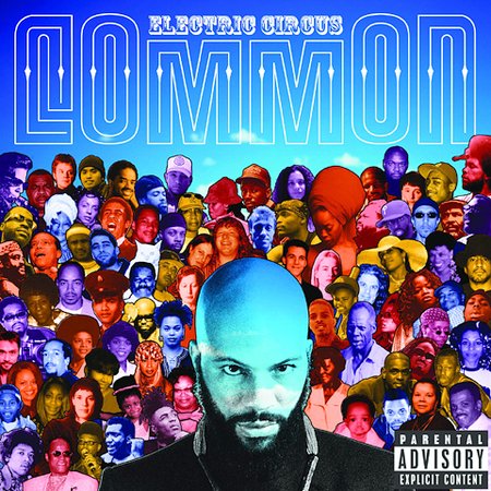
Album: Electric Circus
Release: 2002
What a cool cover. It’s a take on the old Beatles Sgt. Pepper’s cover. The cover is a huge collage of the people important to Common. We see his friends, family, and influences all arranged around him in different color shades with a bigger shot of Common lurking at the camera right in the middle. Above the arrangement of people is a bright blue sky with the album title written in a typical circus font and “Common” in a really cool type face. This cover just works. It’s impactful, it’s art, and it’s cool enough to want to put hang it on the wall and flip through it while listening. This might be my favorite cover of his.
Rating: 8.75
Album: Be
Release: 2005
This was when I think he was REALLY breaking out and getting the respect he deserves. This album is one of his best works so far and he’s got the awards, ratings, and sale stats to prove it. The image is cool. It’s a close up of Common in what appears to be mid-smile. It’s almost out of focus, but isn’t. The golden yellows and graininess of the image gives it a really cool tone. It’s hard not to get a good vibe from this cover. That’s hard to convey, but is done effortlessly here. Just like the music on it.
Rating: 8.25

Album: Finding Forever
Release: 2007
This is not good. I can see what’s being attempted here. For a while this kind of graphic art/loose graffiti look was really popular. It was the “look” for a few years. It was in tons of videos, commercials, print ads, and pretty much everywhere. Sadly, that “everywhere” includes this cover. It doesn’t look “bad” persae, but it looks like Common is the “sassy” spokes model for fancy hoodies. I don’t think that was the intention. If so, mission accomplished. Quick, look away!
Rating: 5.25

Album: Universal Mind Control
Release: 2008
One part “The Matrix”. One part “Grease”. This album cover is strange one. It’s a shadowy “bust shot” of who I assume is Common. The background is white, with the track list in a lighter font. Layered over him are cyber-looking waves and a simple digital font for the album title. I don’t know what they’re going for here. This cover is actually hard to look at.
Rating: 5.75
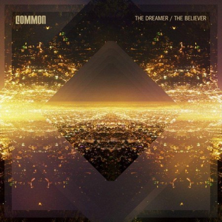
Album: The Dreamer/The Believer
Release: 2011
This is a bad ass looking album cover. It’s something straight out of the trippy LP covers from back in the day. We see an explosion of golds, browns, bronzes, blacks, and various depths of shadow. It’s hard to really explain what’s going on. Is there an explosion surrounding a diamond shape or are we seeing the reflection of a pyramid shape? The whole triangle/pyramid thing associated with hip hop and the illuminati is getting out of hand, but we’ll let it slide because this looks awesome.
Rating: 8.25
What is YOUR favorite Common album cover?
|