BY MICHAEL GOODPASTER
Nine Inch Nails is “my favorite band of all time”. I know it’s mostly Trent Reznor doing his own thing and then hooking up with random session musicians and hired guns to fill out the spots when needed. It’s still a band entity though in terms of classifying it. I guess you could say “Trent Reznor is my favorite musician” or “NIN is my favorite music”.
Over the years my fandom has been a roller coaster of being a super fan boy that paid for fan club membership fees just to have a chance to meet Trent Reznor at one of the “Spiral Meet and Greets”(Out of the ten or so NIN shows I’ve been to I have never met the man, go figure) to being a pretty damn cynical “hater” who wonders what my once-hero’s intentions and motivations were. It’s really easy to judge someone else’s work, but it’s hard to look past your own hang ups and ideals in the process. I will always “love” NIN’s music. There are songs that I connect to more than people I’ve known my entire life. It’s just part of me and who I am. That doesn’t mean I can’t change and grow. Sometimes people grow apart and I guess this whole situation proves that sometimes people and connections of all kinds can grow apart.
I still pride myself on my love for Nine Inch Nails, but it’s not the same. I don’t think it ever will be. As I grow older the angsty teenager inside me is lightening up. I don’t need to cry myself to sleep to the tune of “Something I Can Never Have”. I don’t need to put myself into debt to go to Lollpalooza for an abbreviated set.
For the next few weeks I’m going to focus on Nine Inch Nails. In the upcoming weeks I’m going to provide a “Top 20 NIN Music Videos” in a chunky two-parter and then really dig deep into my fandom and see what happens. Today I’m going to look at the album art of the eight studio LPs.
Maybe at the end of this I’ll find my way back into the NIN mindset or maybe I’ll just “wave, wave, wave goodbye” as my fandom becomes “Nothing”.
Without further ado, let’s look at the album covers of Nine Inch Nails…
Pretty Hate Machine
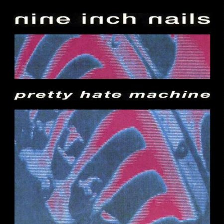
(1989) - This cover was always an interesting one. For such a “dark and evil” band, the brighter blues and pinks of this cover always felt like good contrast. The coloring is just one aspect of this cover. Trent Reznor revealed that the cover was the blades of some sort of turbine stretched vertically so it’d look like a rib cage. The typography is simple and the lay out is just sort of “there”. It works. It’s not the best cover of the collection, but it’s got to start somewhere.
Rating: 6.55
The Downward Spiral
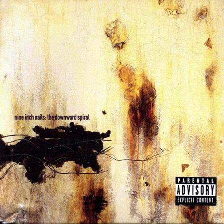
(1994) - Russell Mills did a lot of the NIN artwork in the 90s, but this has to be the most famous of his work at this point. It’s the cover of NIN’s most successful and often thought of as the best album of the discography. It’s a mixed media project. It’s weird to think of something we’ve experienced as a flat image as being textured and layered but this cover is made of plaster, acrylics, oils, rusted metals, insects, moths, blood (mine), wax, varnishes, and surgical bandaging on a wooden panel. All fine ingredients for anyone plotting a downward spiral of their own.
Rating: 8.95
The Fragile
(1999) - This is the cover I connect with most because it’s the album I listened to most and read the liner notes of the CD most. Yeah, remember when that awesomeness was a thing? The artwork of this era was awesome. It was a blurred and skewed look at blues, greens, and random lively beauty. Lots of close ups of flowers, feathers, and calming shades. The whole design was because of a developing error where the film got ruined. They decided to go with one of the errors and NIN-history was made.
Rating: 8.5
With Teeth
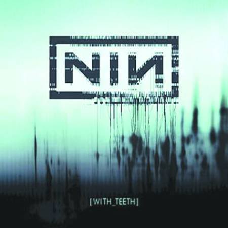
(2005) - I’ve always liked this cover. This album doesn’t get enough acclaim for the great stuff on it. It’s just a solid album. This was also the tour I went to for eight or nine shows so I’m a little bias. The cover is cool regardless. It’s got the same “vibe” as older NIN stuff, but it’s brighter and starts to have a more “digital disaster” type of motif. I really like the subtle bleeds and the distant blues and greens. Designer Rob Sheridan gives us layers upon layers in this awesome piece. It’s easy to just look at the get lost in for a while.
Rating: 8.35
Year Zero
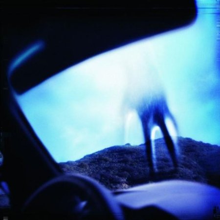
(2007) - I love this cover. It doesn’t seem like much, but it represents a bigger picture. The release of Year Zero had a whole world behind it that involved clues, leaks, and a whole alternate reality that we’d be gives bits and pieces of as we got closer to the release. It was one of the coolest interactive experiences I’ve ever had with a band and on the low it’s one of the greatest music marketing experiences I’ve ever heard of. It was just magic. The cover is the “hand of god” coming down from the sky. The perspective is from the inside of a car. It’s blurry, skewed, and in an eerie blue tint. It’s very “X-Files-ish” and looks cool on its own merit, but the backstory is what makes it so cool.
Rating: 8.75
Ghosts I-IV
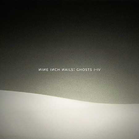
(2008) - There isn’t much going on in this cover, but there doesn’t have to be. The cover was originally released as a mere JPG file that came along with the free download of the album. It’s in the same ballpark of the imagery being used at this time, but it’s nothing too specific. It’s a curved line dividing shades of grey. There is a lot of depth in its simplicity. It’s not going to blow the world away, but it’s perfect for a massive instrumental release like this.
Rating: 7.0
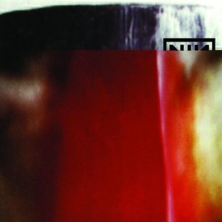
The Slip
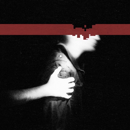
(2008) - It’s not that I hate this cover, but I just feel unaffected by it. I’ve been a fan long enough to recognize that’s Trent Reznor’s blurred profile. The year is cut off via red strip with digital damage. The arm that’s on Trent’s arm is apparently Alessandro Cortini, despite him not performing on the album. Visually this cover is okay. It’s artistic and fits the theme, but it’s one of the least engaging images of the NIN history.
Rating: 6.25
Hesitation Marks
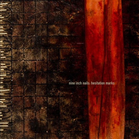
(2013) - We finish this journey through the LP collection of Nine Inch Nails with a pretty recent release. While the album isn’t getting nearly as much love as it should, the cover is what’s really under appreciated. For the first time in a long time they have Russell Mills return to the cover. He produced five different versions of the album for each of the different release editions. Trent was originally seeking one design, but couldn’t choose between the bunch. These aren’t just digital designs that someone did on a computer. These are amazing pieces of art. The “main cover” uses plaster, dirt, oils, etching varnish, burning, rusted linen, BLOOD, spent matches, and wood as others include things like copper wire, velvet and microscope slides among other ingredients for these mixed media projects. Yeah, I said BLOOD! Awesome.
Rating: 9.5
What is YOUR favorite Nine Inch Nails album cover?
|