BY MICHAEL GOODPASTER

311 is one of those bands. They started in the 90’s, rose to a certain level of popularity and acclaim, settled down a bit, rose back to the forefront with a single or two, settled, rose, settle, rose, rinse and repeat. They’re just a solid consistent band that’s been around forever, that has a devote fan base and has more hit singles than most casual fans probably realize.
They have a hip hop element to their rockiness. It’s kind of a ”funk rock” type of feeling. It’s a unique enough sound to never really be “dated”, but just because some of the songs have been in radio rotation for so long they still have a classic vibe. They put on a great live show and seem to really go out of their way for their fans. They even have fan cruise where they go out and hang with the fans, play, and just have a good engaging time. How can you hate on that? You can’t!
We’ve heard and enjoyed the songs (or at least we should). We’ve seen the videos (or at least we should). We’ve seen them live (or at least we should). We’ve grown up with 311 (never grow up!).
But what about the album covers? Today we’ll take a look at their album covers and place objective judgment upon them.
Dammit!
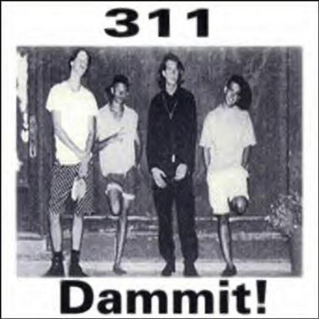
(1990) - This was the band’s first “official release” according to most folks. It was a self-released CASETTE tape. Yeah, those old cool plastic things that would get eaten by shoddy players. On top of this, they only printed 300 copies. The album cover is pretty generic. It’s a black and white photo of the band with a very basic font above and below it. It’s a cool look back and obviously made on the cheap. If I had to grade it on a curve, I like it just because of the history and the novelty of it. I’m not a “die hard” fan so I really can’t grade it on that curve though. It’s still a cheap black and white photo with a really simple font.
Rating: 4.5
Unity

(1991) - A lot like the first album, this is an independent release clearly made on the cheap. I respect and appreciate that being an artist who has released my own films and projects on the cheap. Being broke doesn’t mean you can’t put some effort and style into the visuals though. This is a pretty interesting cover. The photo is centered and this time the generic font is on the left and right of it. I’m not going to hate on it or anything. I know some really cool stuff is just on the horizon.
Rating: 4.75
Music
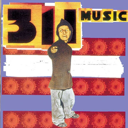
(1993) - See. This cover has some production quality behind it. I don’t think anyone can argue the crazy difference between the first two indie releases and this bad boy. It’s a drawn dude in a hood loitering in front of some color and graphics. Red strips with suns, a purple-ish background, a white splotch, and a much more stylized font and text choice. If you’ve been privledged to know 311’s work, you’ll know this will not be their best cover. It’s just a really decent start. The vibe and feel of it hits the mark on the early 90’s and the band itself.
Rating: 6.5
Grassroots

(1994) - This was another step forward and really starting to find the visual voice of what 311 would start to offer. Instantly you notice their cool logo finally being used and presented. The title text works nicely too. I really like this cover. It’s abstract and engaging. The colors have a really interesting blend and it’s easy to just take a breath and take in what you’re looking at. It’s not mind blowing or anything, but it’s another solid step forward.
Rating: 7.0
311
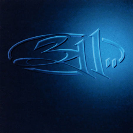
(1995) - This is simple and to the point. It’s that cool ass logo featured bold and centered on a background of blue. It’s easy to look at, it’s not trying to be anything else. This is the simplistic cool type of album art that makes you think about the old school 12 inch vinyl albums. Then if you factor in the massive hits from this release, it’s hard to really say anything bad about it. This album gave us “Down” and “All Mixed Up”. Thank you.
Rating: 6.75
Transistor

(1997) - This was another big album. It got some weird critic feedback for being “too long”, but it’s still a paramount release in the lineage of this band. It’s literally transistors with a zen twist floating in the sky. The band name is on the transistors and the album title font is simple, but stylized in a complimentary way. Like I said before, this is another one of those covers you could visualize finding in your dad’s old LP collection. That always gets extra points from me. I’m also a bit bias because my favorite 311 song is “Beautiful Disaster” so when I see this album cover I automatically hear the song in the jukebox in my head. Yeah, I got a jukebox in my head. Don’t you?
Rating: 7.5
Soundsystem

(1999) - I dig this cover a lot. It’s some really solid design work with popping colors, an interesting lay out, and awesome representation of the band. It’s not like their definitive album cover or anything, but it’s a nice stop along the way. It’s got a record, speakers, and feels like a polite 1960’s acid trip. If I have to pick something to gripe about, I’ll say the album title font is cool, but isn’t clear enough. It’s like a hip hop version of one of those really lame metal logos where it looks like a bunch of scratches mixed with “spooky” tree branches and the scribbles of a slow child. Not THAT bad, but it’s still a little off. All in all, good stuff though.
Rating: 7.0
From Chaos
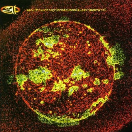
(2001) - This album came out the year I graduated high school so of course I had it. Plus this release gave us “You Wouldn’t Believe”, a really underrated single and “Amber”, one of their most accessible singles. My girlfriend doesn’t know much about 311, but when I brought them up to her she lit up and started singing a line or two from “Amber”. I’m fairly sure it’s the band’s biggest single in terms of expanding outside of the genre. The image is pretty cool. It’s another abstract type of image. It’s a red sphere with a molten lava type of thing to it. It’s just an interesting cover. It’s hard to really pin point what it is. I’m sure there is a cool story behind it, but I’m looking at it from the perspective of someone going through CDs at a local CD store. In that respect, I like the colors and I think it’s a pretty captivating cover. Obviously a good portion of their fans toy with mind altering medicine so this would be a nice complimentary visual to that.
Rating: 8.5
Evolver

(2003) - I own this CD as well, but it didn’t have nearly as much impact on me as the 2001 release. The cover is really cool. On the CD, they did one of those “Enhanced” deals where you could pop it in and get extra content. The content on this one was actually the “making of” the album cover itself. They put a lot of detail and time into it. It appears to be a hotel lobby with the band spread out doing different things. There is A LOT going on and it’s cool to see this much detail put into an album cover. It’s not a logo, a drawing or an airbrushed band shot. It’s got tons of depth and things to stare at. That in itself is a big reason I think this cover is great. Any time you can find an album cover that you can stare at and take in new aspects of after many viewings is awesome. The whole album and a lot of history are subtly represented in this. Great cover.
Rating: 9.5
Don’t Tread on Me
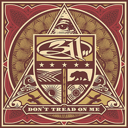
(2005) - I think after the Evolver album the band really kicked it into high gear in terms of album art. This cover rocks. It’s a cool ass cover. Simple as that. It has the same design style of American currency. Well at least the dollars before they started looking like Monopoly money. There is tons of hidden design in this and while there are clearly some recognizable images it’s still an abstract collage of sorts. I like the design, the color choices, and lay out. This would be a cool poster, a cool T-shirt, and definitely a cool album cover.
Rating: 8.75
Uplifter

(2009) - Sadly at this point I lost touch with 311. I just stopped hearing much about them and didn’t really hear their new music. If a single popped up it didn’t stick with me enough for me to remember it five years later. That said, I love the cover. It’s beautifully done and flat out “art”. The 311 logo is featured at the bottom in a designed circle. From there there’s branches that come upward that showcase tons of little circles with really cool designs. This is another cover that you can stare at for extended periods of time and just be captivated. I’d love to have this album art framed and on a wall in my office.
Rating: 9.0
Universal Pulse

(2011) - Holy shit. This album is so cool that it’s almost hard to look at. There is TONS going on here and it’s trippy as hell. There’s a goat, a monkey, the moon, an island, a tree, space, a big triangle, and a swirly pulse that just makes everything that much more awe inspiring. Sonny Kay’s artwork here is top notch. The design, the colors, and the production of it all is one of the coolest album covers I’ve seen in a long time.
Rating: 9.75
Stereolithic
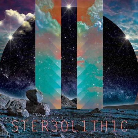
(2014) - I have no frame of reference to any of the music on this album, but I dig the cover. It’s another trippy piece of art that’s enthralling, engaging, and just cool. It’s almost hard to describe, but I’ll try. There is a rocky atmosphere, maybe mountains or on the moon or something. On the horizon is a sphere of space in front of a really serene looking cloudy sky. Then there’s two strips of light coming down that give a bizzaro negative look inside of them. Below all of this is a cool looking font that uses numbers in place of a few letters. There. I tried. I clearly didn’t do it justice. When it’s hard to describe the artwork but not hard to appreciate it then they’re on to something.
Rating: 8.75
What is YOUR favorite 311 album cover?
|